
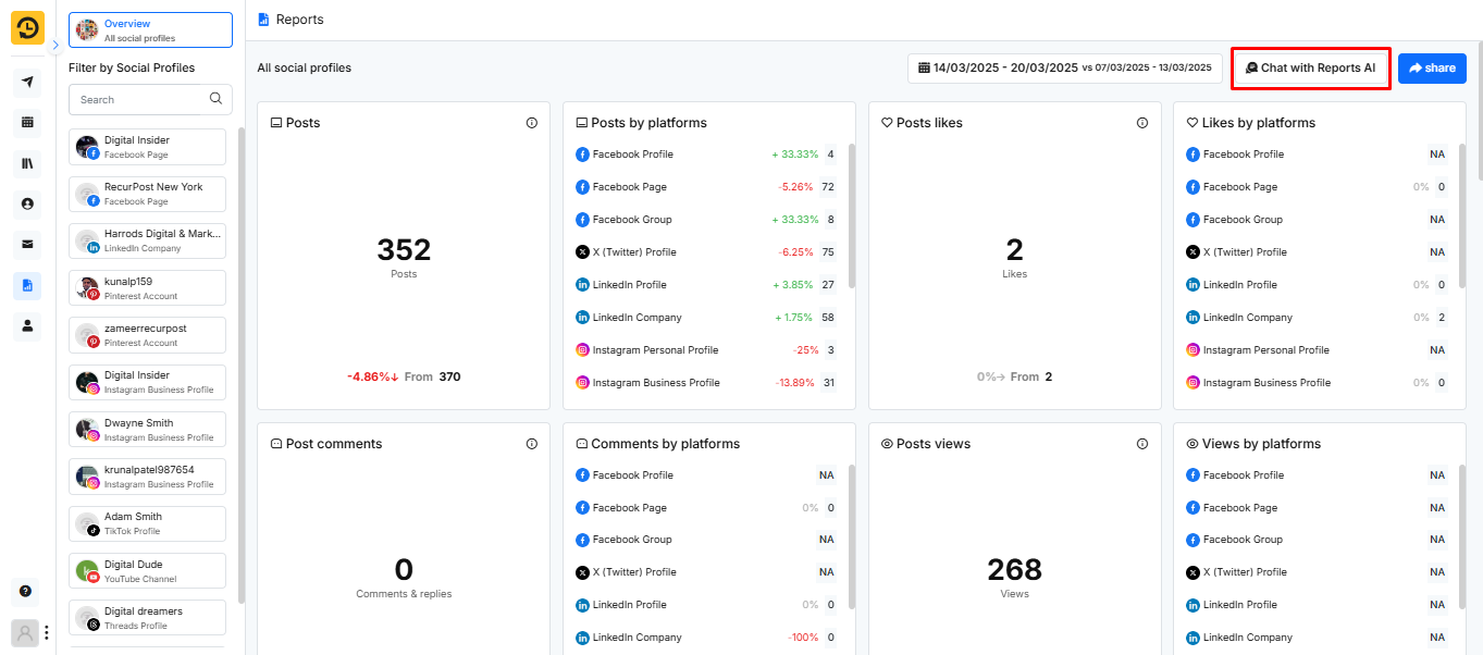
At any given time, RecurPost allows you to understand your business and organize the performance reports. It does so by gathering data from your social media accounts and studying the behavior of your audience.
Using our algorithm, we give you a complete idea of how your posts performed. For each social platform, we study which post gathered the most attention.
As you open the report page, you will see a clear graphical representation of your performance along with facts and figures. It will help you to better understand your business standing and compare your performance to optimize your posts to gain maximum traffic.
How to see Overall Engagement?
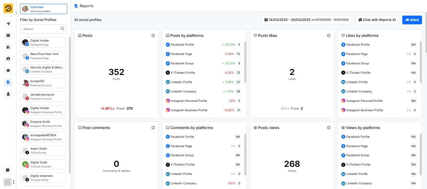
As you open the report page, you’ll first see the total number of posts, likes, comments, views, and engagement your content has received across various social platforms.
This gives you a basic overview of your total social media engagement. If you’re looking for more in-depth insights, the report breaks down your performance by specific platforms, including details like post likes, comments, and views per platform. This breakdown helps you better understand which platforms are performing well and where adjustments might be needed to improve your social media strategy.
Engagement By Platform
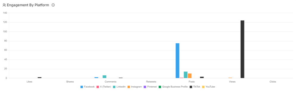
This report shows the total number of likes, comments, posts, and other interactions received on each social media platform. By viewing this data, you can understand which platform has the most engaged audience and where you’re receiving the highest level of attention. This can help you prioritize platforms and focus on where your content resonates best.
Note: The “Reports” page reflects engagement metrics such as likes, shares, comments, and re-tweets within the initial 7 days following the post’s publication. After this period, the data is not retrieved.
Engagement By Library
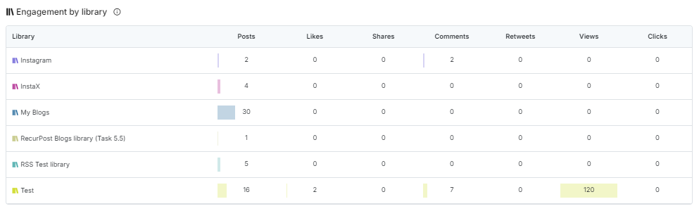
This report shows the total number of likes, comments, posts, and other interactions received by each library across multiple social media platforms. It helps you identify which content resonates with your audience and what might need to be revised or removed based on performance.
Top Posts
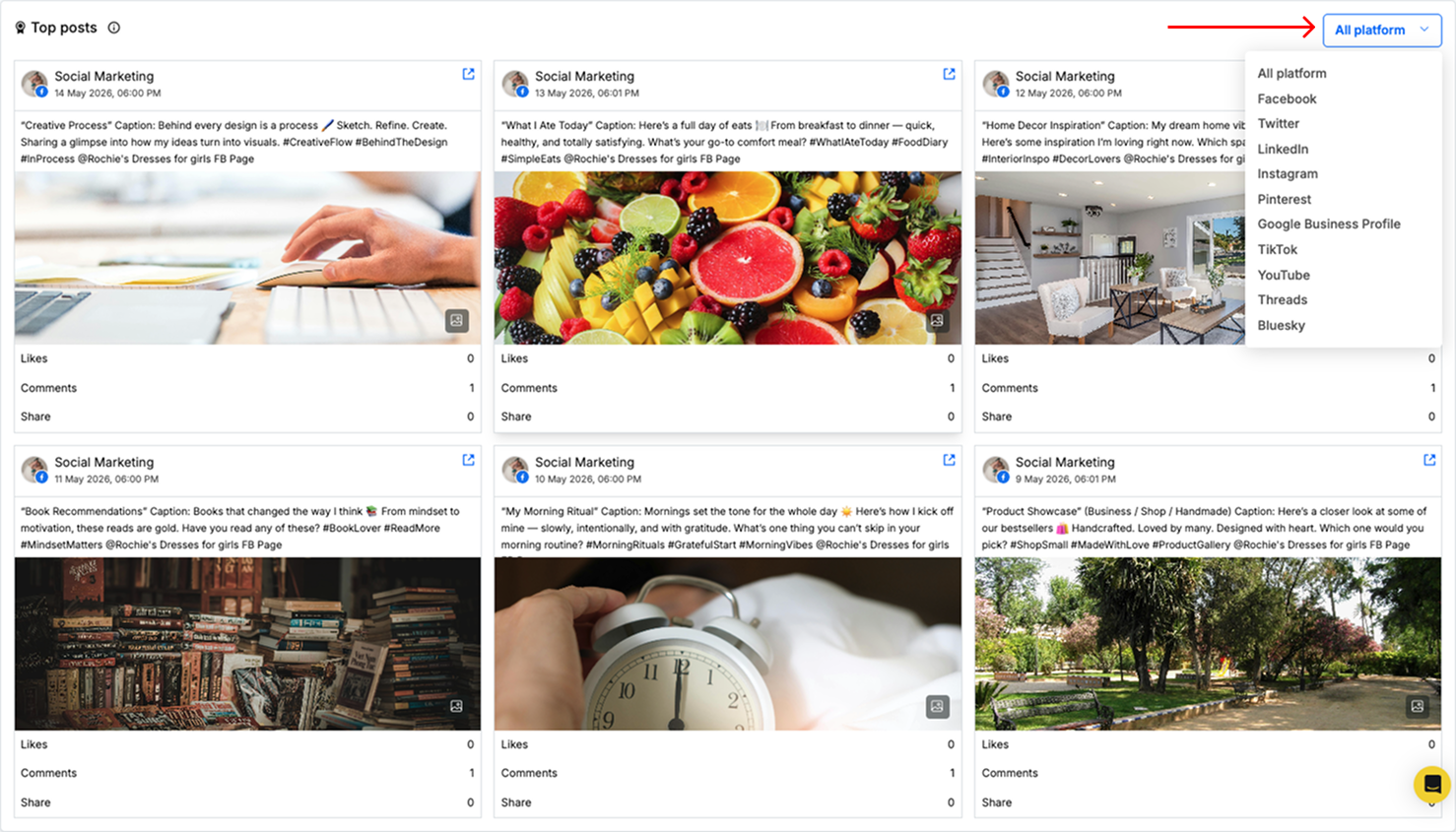
This section displays your top posts, highlighting the content that is most liked and engaged by your audience. It helps you identify which posts resonate best with your viewers, allowing you to tailor future content to match their preferences. Additionally, the option to filter by social platform makes it easier to see the top-performing posts on each network individually, giving more targeted insights.
White Label Reports
Through the white-label reports, you can easily add your company’s logo in place of RecurPost’s logo to customize your reports.
Not just an overall report, RecurPost also helps you to study all the necessary details. To understand each social platform better, we provide you with statistics that help you get a clear idea of your social standing.
Our algorithm scans your performance on each platform and tells you where the improvements are needed. This allows you to visualize your data and interaction with your viewers, and also the total attention received.
To enable this, upload your logo in Account Settings → White Labeling. Once saved, the logo is used automatically in branded report exports and other supported shareable views.
1. How to see Facebook Page Analytics?
When you open your Facebook Page report, you see two things at the top: a Profile Overview and a Performance Snapshot.
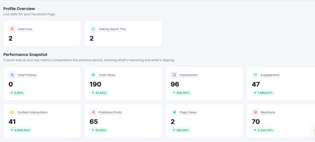
Profile Overview
The Profile Overview shows live stats for your Facebook Page. It displays two numbers at a glance:
- Total Fans: How many people like your Page
- Talking About: How many people are talking about your Page right now
Performance Snapshot
The Performance Snapshot sits just below the Profile Overview. It compares your key metrics from the selected date range against the previous period.
Metrics shown include:
- Total Follows: New follows gained during the period
- Total Views: How many times your content was viewed
- Impressions: How many times have your posts appeared on screen
- Engagement: Total interactions with your posts
- Content Interactions: Clicks, reactions, and other actions on your content
- Published Posts: How many posts have you published in the period
- Page Views: How many times your Page profile was visited
- Reactions: Total likes, loves, and other reactions received
Each metric shows a percentage change with a green (up), red (down), or grey (no change) label. This tells you at a glance whether your performance improved or dropped compared to the last period.
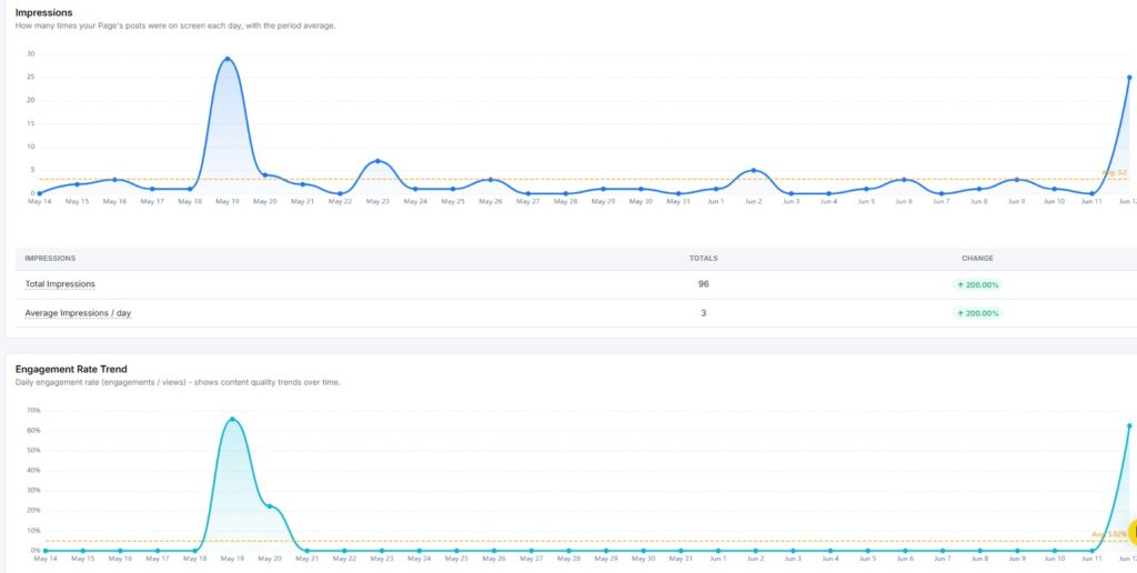
Impressions
The Impressions report shows how many times your Page’s posts were on screen each day during the selected period.
Key metrics include:
- Total Impressions: The overall number of times your content was displayed
- Average Impressions / Day: The average number of impressions your content received daily
Engagement Rate Trend
The Engagement Rate Trend report shows your daily engagement rate, calculated as engagements divided by views. The graph plots your daily rate as a line, with an average line for quick reference.
Use this to spot which days your content connected best with your audience and which days need a different approach.
Page Follows
The Page Follows report shows your net change in followers over the selected period.
Key metrics include:
- Follows: New followers gained
- Unfollows: Followers lost
Follower Growth Trend
The Follower Growth Trend chart shows your cumulative net follower count across the selected period. The line tracks how your total followers moved day by day, ending with your net change for the period.
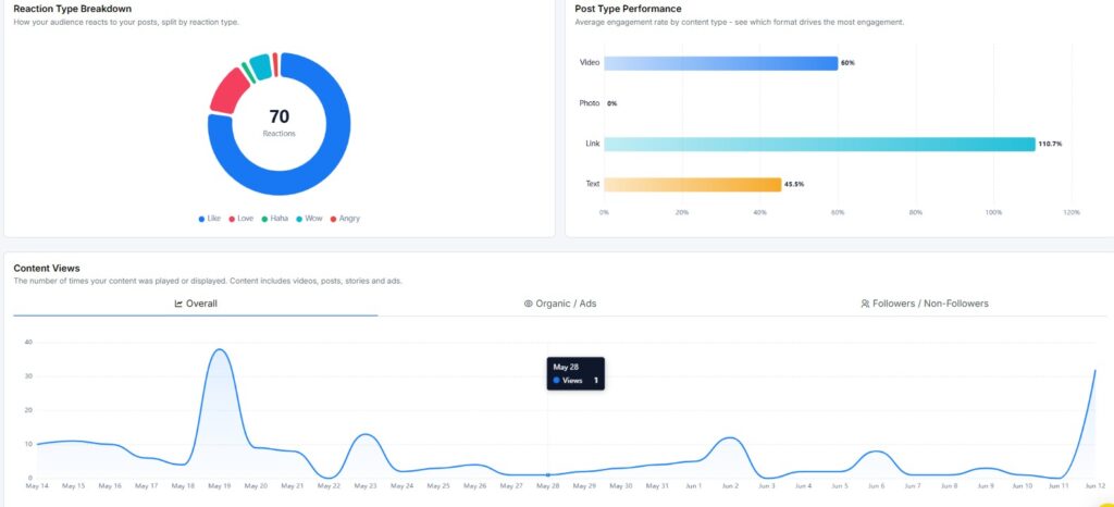
Reaction Type Breakdown
The Reaction Type Breakdown shows a donut chart of how fans reacted to your content – Like, Love, Haha, Wow, and Angry. This helps you understand the emotional response your content is getting, not just the raw reaction count.
Post Type Performance
The Post Type Performance chart compares engagement across your content formats – Text, Link, Photo, and Video. Use this to see which format is earning the most engagement relative to how often you post it.
Content Views
The Content Views report tracks how many times your content was played or displayed during the selected period, with the total and percentage change vs. the previous period.
Views Source & Audience Origin
This section shows where your views are coming from, split into two ways:
- Organic vs. Ads: How many views came from unpaid reach versus paid promotion
- Followers vs. Non-Followers: How many views came from people who already follow your Page versus people who don’t
A high share of views from non-followers means your content is reaching new people beyond your existing audience.
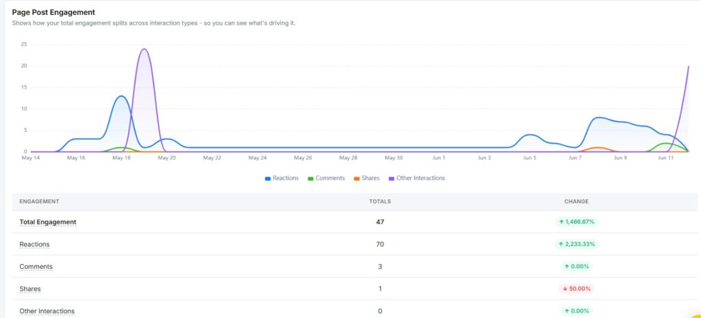
Page Post Engagement
The Page Post Engagement report shows how your total engagement splits across interaction types.
Key metrics include:
- Total Engagement: All interactions combined
- Reactions: Likes, loves, and other reactions
- Comments: Total comments received
- Shares: Total times your content was shared
- Other Interactions: Any additional interaction types
The chart breaks these down by day so you can see exactly when activity spiked.
Top Locations
The Top Locations section shows where your followers are based, broken down by top countries and top cities. If your Page doesn’t have enough audience data yet, this section will show no data available.
Best Time to Post
The Best Time to Post report shows a heatmap of your best posting windows, based on your own posts’ timestamps and their engagement. The grid plots days of the week on the Y-axis and hours of the day on the X-axis.
Darker cells indicate higher engagement during that time slot. Use this to schedule your future posts at your peak times.
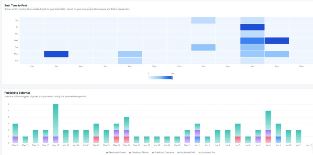
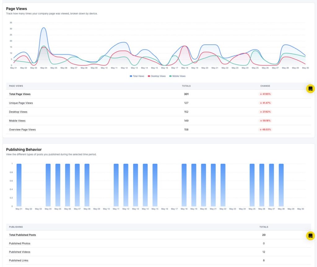
Publishing Behavior
The Publishing Behavior report shows how many posts you published during the selected period, broken down by type.
Key metrics include:
- Total Published Posts: The overall number of posts published
- Published Videos: Number of video posts
- Published Photos: Number of photo posts
- Published Carousels: Number of carousel posts
- Published Links: Number of link posts
- Published Text: Number of text-only posts
Each metric shows a percentage change vs. the previous period, helping you see how your content mix is shifting.
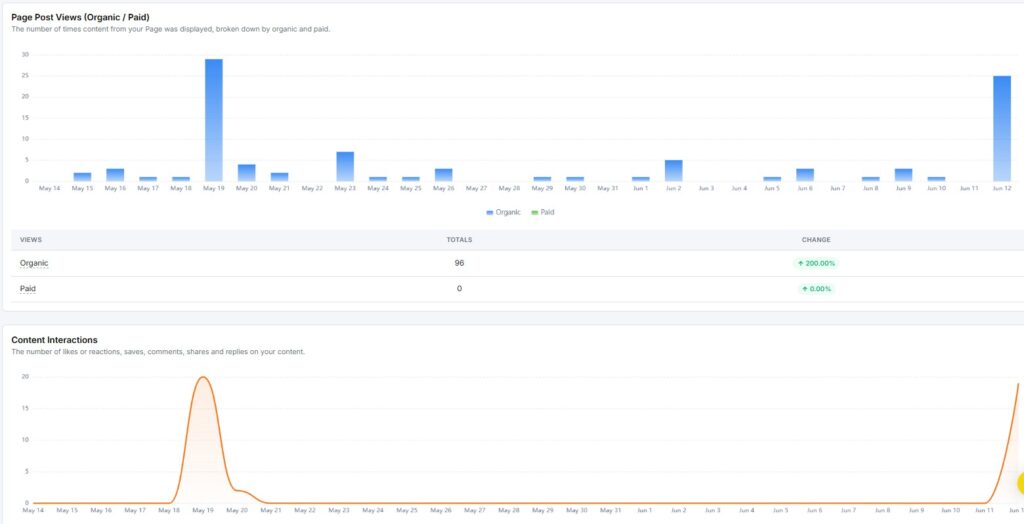
Page Post Views & Content Interactions
This section shows two charts side by side:
- Page Post Views (Organic / Paid): How many views your posts received, split between organic reach and paid promotion
- Content Interactions: Your total interactions trend over the selected period
Video & Profile Visits
This section tracks two more metrics:
- Page Video Views: Daily views on your video content, with the total for the period
- Page Views: Daily visits to your Page profile, with the total for the period
Recent Posts
The Recent Posts section shows the latest posts published during the selected period. Each postcard displays the post content, publish date and time, and its engagement breakdown – total engagements, reactions, comments, shares, and views.
Click +More to see your full post history beyond the selected date range.
2. How to see Instagram Analytics?
When you open your Instagram report, you see two things at the top: a Profile Overview and a Performance Snapshot.
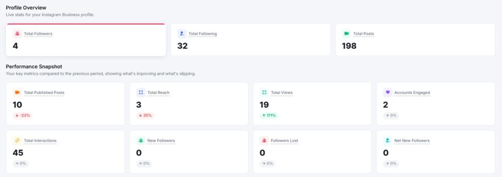
Profile Overview
The Profile Overview shows live stats for your Instagram Business Profile. It displays three numbers at a glance:
- Followers: Total number of people who follow your account
- Following: Total accounts you follow
- Posts: Total posts published on your profile
Performance Snapshot
The Performance Snapshot sits just below the Profile Overview. It compares your key metrics from the selected date range against the previous period.
Metrics shown include:
- Total Reach: Unique accounts that saw your content
- Total Views: Total number of times your content was viewed
- Total Accounts Engaged: Unique accounts that interacted with your posts
- Total Interactions: Combined likes, comments, saves, and shares
- New Followers: Followers gained during the period
- Followers Lost: Followers who unfollowed during the period
- Net New Followers: New followers minus followers lost
- Profile Link Clicks: Clicks on the link in your bio
Each metric shows a percentage change with a green (up), red (down), or grey (no change) label. This tells you at a glance whether your performance went up or down compared to the last period.
You can also select a custom date range longer than 30 days. This lets you review campaigns, launches, and seasonal performance in one continuous view.
Reach & Visibility Trend
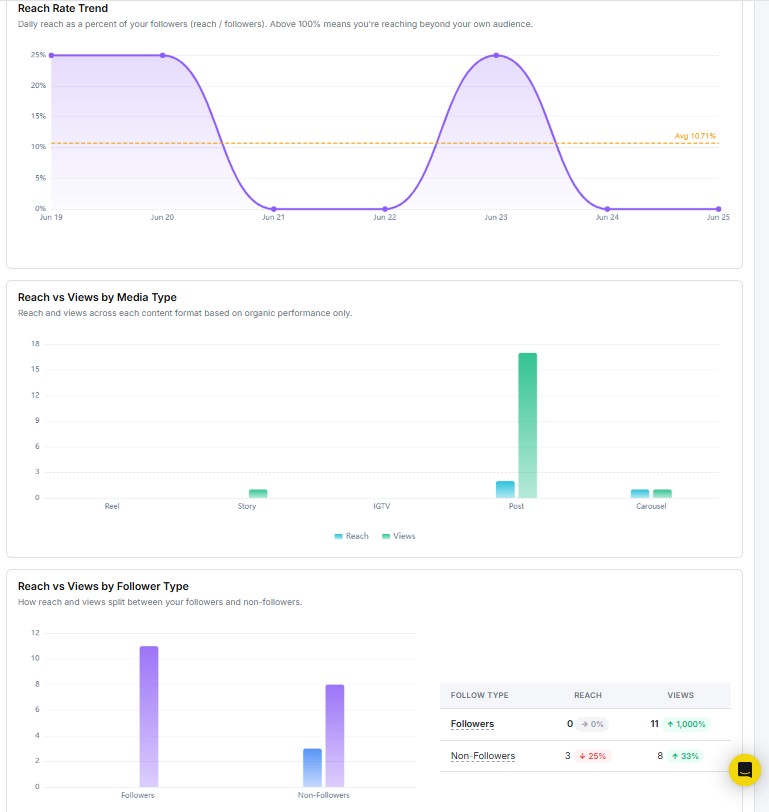
The Reach & Visibility Trend report shows how many unique accounts saw your content over time and how your overall visibility moved across the selected period.
The main line chart at the top plots your daily reach. Spikes on specific dates indicate days of high visibility and help you identify when your audience was most active.
Additional breakdowns include:
- Reach by Audience Type: A pie chart splitting reach between followers and non-followers. A high non-follower share means your content is reaching new people beyond your existing audience.
- Reach by Media Product Type: Shows which content formats- Reels, Posts, Stories, Carousels contributed most to your total reach.
- Reach vs Views by Media Type: Compares unique reach against total views per format. A higher view count than reach signals strong repeat interest in that format.
- Follow Type Table: A side-by-side breakdown of reach and views from followers vs. non-followers, with period-over-period percentage change for each.
- Reach vs Views by Follower Type: A bar chart that visually confirms engagement trends between audience segments.
Use this report to fine-tune your publishing schedule, understand how different audience segments interact with your content, and identify which formats drive the most visibility.
Reel Performance Analytics
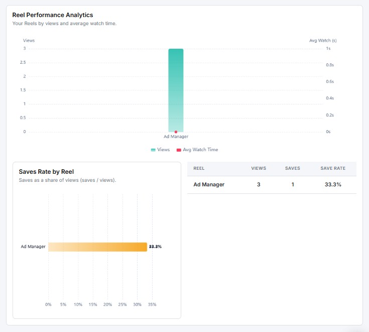
The Reel Performance Analytics section gives you a dedicated view of how your Reels are performing.
Key metrics shown include:
- Views: Total number of times your Reels were played
- Reach: Unique accounts that saw your Reels
- Likes, Comments, Saves, Shares: Engagement breakdown per interaction type
- Saves Rate by Reel: Tracks how often viewers saved individual Reels, helping you identify which content is worth bookmarking
This report helps you spot which Reels are driving the most engagement and reach, so you can focus on the formats and topics that resonate most.
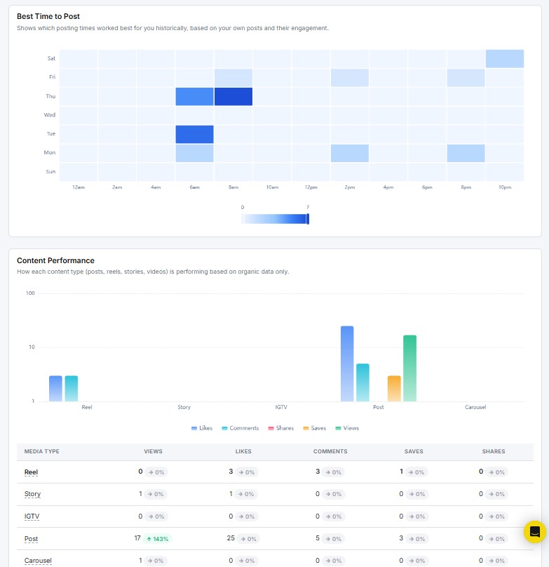
Best Time to Post
The Best Time to Post report shows a heatmap of your optimal posting windows, based on how your past posts performed. The grid plots days of the week on the Y-axis and hours of the day on the X-axis.
Darker cells indicate higher engagement during that time slot. Use this to schedule future posts at your peak times for better reach and interaction.
Content Performance
The Content Performance report breaks down how each media type performs across the selected period.
Formats tracked include:
- Reels
- Posts
- Stories
- IGTV
- Carousels
Key metrics displayed for each format include:
- Views: Number of times the content was viewed
- Likes: Total likes received
- Comments: Viewer comments
- Saves: Number of users who saved the content
- Shares: How often the content was shared
Save Rate by Content Type is also shown, giving you a sense of which formats your audience finds worth revisiting.
Use this report to see which content types drive the most engagement and shift your strategy toward what’s working.
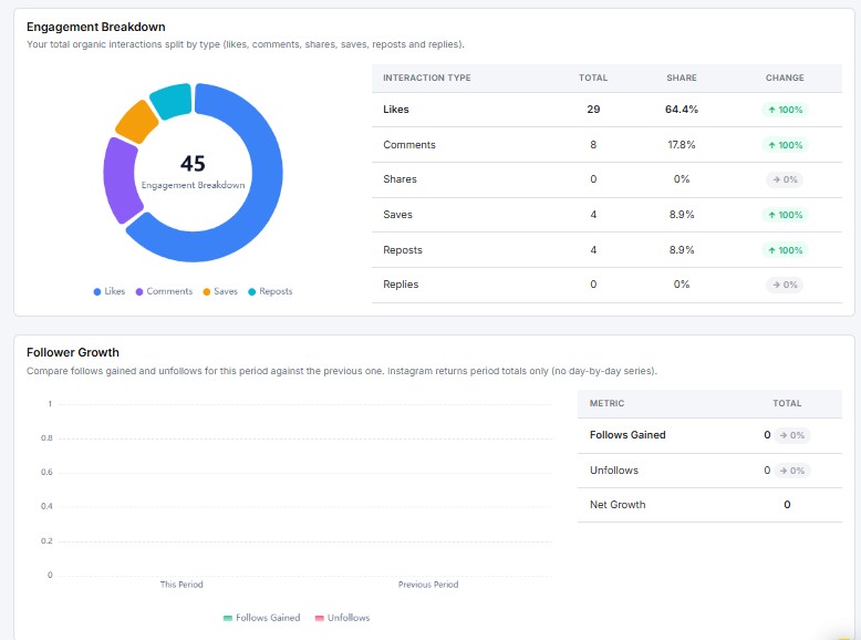
Engagement Breakdown
The Engagement Breakdown report shows how your total interactions are split across engagement types during the selected period.
Interaction types tracked include:
- Likes
- Comments
- Saves
- Shares
A donut chart gives you a visual split, while the table on the right shows exact counts and percentages for each type. If your breakdown is heavily skewed toward likes with few saves or shares, your content may be getting passive reactions. Aim for a mix that includes saves and shares for a stronger audience connection.
Follower Growth
The Follower Growth report tracks how your follower count changed during the selected period.
Key metrics include:
- Followers Gained: New followers added
- Followers Lost: Followers who left
- Net New Followers: The net change for the period
The chart plots daily gains and losses so you can spot exactly when growth spiked or dipped.
Follower Demographics
The Follower Demographics section shows the age and gender breakdown of your followers.
Note: Instagram requires a minimum follower count before demographic data becomes available. If this section shows no data, your account may not yet meet the threshold.
Audience Demographics
The Audience Demographics section gives a deeper view of the people engaging with your content.
Two charts are shown:
- Engaged Audience by Age: How your engaged audience breaks down across age groups
- Engaged Audience by Gender: The gender split of your engaged audience
A world map and table below these charts show the top countries and cities where your audience is based. Use this to make decisions about posting times and regional content.
Calls to Action
The Calls to Action report tracks how often users take direct actions from your Instagram profile — clicking your website link, calling your business, sending an email, or sending a message.
Action types tracked include:
- Book Now
- Call
- Direction
- Text
- Instant Experience
Zero activity across these actions may mean your profile contact options aren’t prominent enough, or that your audience hasn’t been prompted to act. Adding a clear call-to-action in your bio or captions can push these numbers up.
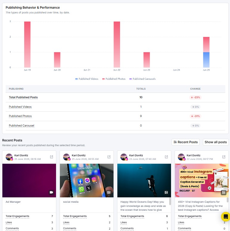
Publishing Behavior & Performance
The Publishing Behavior & Performance report shows how many posts you published during the selected period, broken down by content type.
Key metrics include:
- Total Published Posts: Overall posts published
- Published Reels: Number of Reels posted
- Published Carousels: Number of carousel posts
- Published Photos: Number of single-image posts
- Published Stories: Number of Stories posted
Each metric shows a percentage change vs. the previous period, so you can track how your content mix is shifting over time.
Recent Posts
The Recent Posts section shows the latest posts published during the selected period. Each postcard displays the post content, publish date and time, and its engagement breakdown, including total interactions, likes, comments, saves, shares, and views.
Click Show all posts to see your full post history beyond the selected date range.
3. How to see LinkedIn Profile Analytics?
RecurPost supports LinkedIn Profile analytics, allowing individuals and professionals to track how their personal LinkedIn posts perform directly from the RecurPost dashboard.
Important points to note:
- Under LinkedIn Profile Individual reports, we can only show Reactions, Comments and Views (views are only for video posts) as per LinkedIn API support.
- RecurPost can only display metrics for posts shared via RecurPost. Posts published directly on LinkedIn (without RecurPost) will not appear in the Profile analytics on the Reports page.
You can access these insights in two places (Reports and History Page):
Reports Page
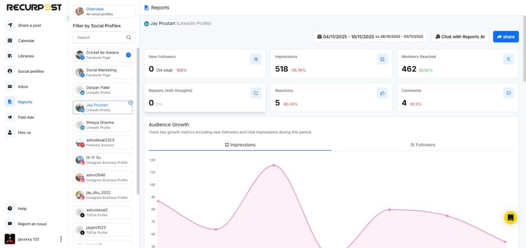
- Displays overall engagement metrics for posts shared to your LinkedIn Profile via RecurPost only.
- Includes impressions, likes, comments, and shares.
- Offers visual graphs for a better understanding of total engagement and audience activity.
- Helps you assess which posts received the most attention on your profile.
History Page
- Shows post-level insights for your LinkedIn Profile posts shared through RecurPost.
- You can view likes, comments, and shares for each post individually and we can only fetch likes data of 1 month (last 30 days) for the LinkedIn profile.
- Ideal for tracking personal content performance over time.
This update gives users a complete LinkedIn performance view, whether managing company pages or personal profiles, making it easier to refine both brand and personal content strategies for better visibility and engagement.
4. How to see LinkedIn Company Analytics?
When you open your LinkedIn Company report, you see two things at the top: a Profile Overview and a Performance Snapshot.
Important: Under LinkedIn Company Page reports, RecurPost can only retrieve Reactions and Comments for individual posts, not Views, as per LinkedIn API support.
Profile Overview
The Profile Overview shows live stats for your LinkedIn Company Page. It displays two numbers at a glance:
- Total Followers: How many people follow your Company Page
- Total Employees: The number of employees listed on your Page
Performance Snapshot
The Performance Snapshot sits just below the Profile Overview. It compares your key metrics from the selected date range against the previous period.
Metrics shown include:
- Total Impressions: How many times your posts appeared on screen
- Total Engagements: Combined reactions, comments, shares, and clicks
- Engagement Rate: Engagements as a percentage of impressions
- Post Clicks: How many times users clicked on your posts
- Published Posts: How many posts have you published in the period
- Reactions: Total reactions received
- Comments: Total comments received
- Shares: Total times your content was shared
Each metric shows a percentage change with a green (up), red (down), or grey (no change) label. This tells you at a glance whether your performance improved or dropped compared to the last period.
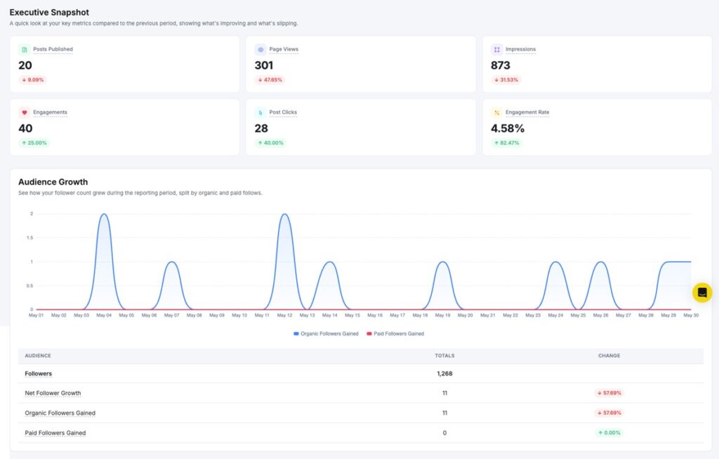
Audience Growth
The Audience Growth report shows how your follower count moved during the reporting period.
Key metrics include:
- Followers: Total followers on your Page
- Net Follower Growth: Overall followers gained or lost
- Organic Followers Gained: New followers from unpaid reach
- Paid Followers Gained: New followers from paid promotions
The chart plots daily follower changes so you can spot exactly when growth spiked or slowed.
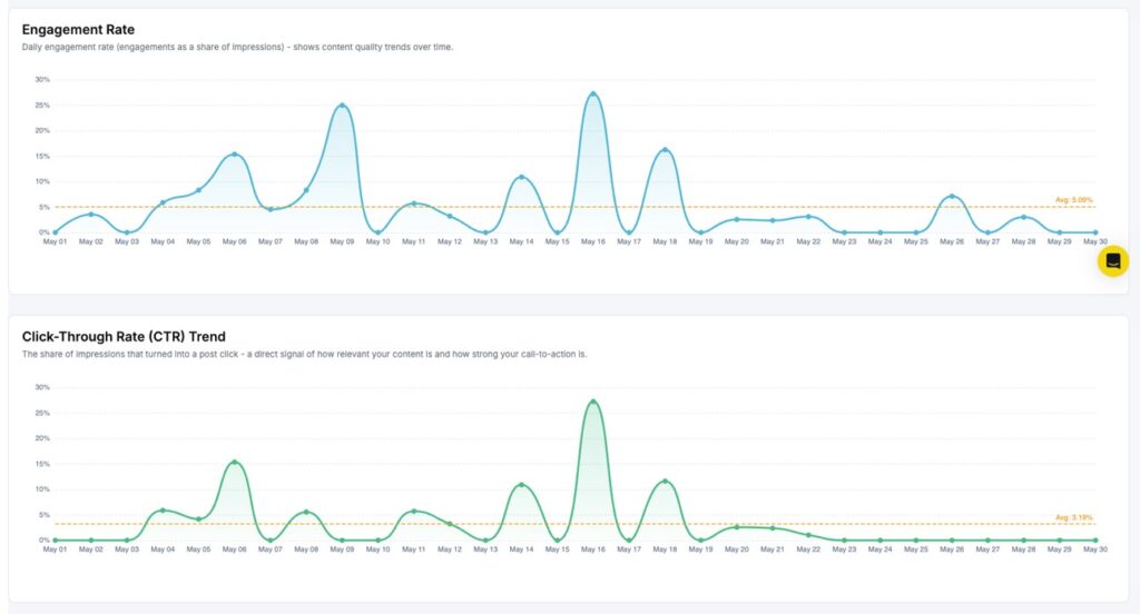
Engagement Rate Trend
The Engagement Rate Trend report tracks your daily engagement rate across the selected period. It is calculated as engagements divided by impressions.
The graph plots your daily rate as a line, with an average line shown for quick reference. Use this to find which days your content connected best with your audience.
Click-Through Rate (CTR) Trend
The CTR Trend report shows the daily ratio of post clicks to impressions. It tells you how well your posts drive users to take action.
A rising CTR means your content is prompting more clicks. If the rate stays flat, try adjusting your post format or call-to-action.
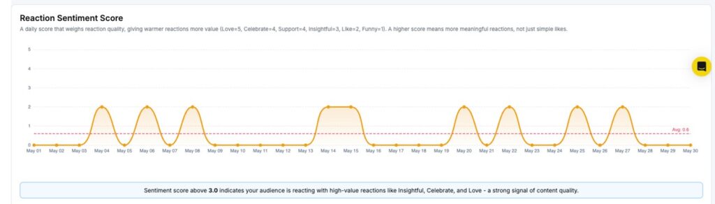
Reaction Sentiment
The Reaction Sentiment report shows a donut chart of how your audience reacted to your content – Like, Celebrate, Support, Love, Insightful, and Funny. This helps you understand the emotional response your posts are getting beyond a raw reaction count.
Amplification Rate
The Amplification Rate measures how often your content gets shared per post published each day. A higher rate means your audience is actively spreading your content to their own networks.
Conversation Rate
The Conversation Rate tracks how many comments your posts receive per post published each day. More comments signal that your content is sparking real discussions.
Impressions
The Impressions report shows how many times your Page’s posts appeared on screen during the selected period.
Key metrics include:
- Total Impressions: The overall number of times your content was displayed
- Average Daily Impressions: The average number of impressions per day
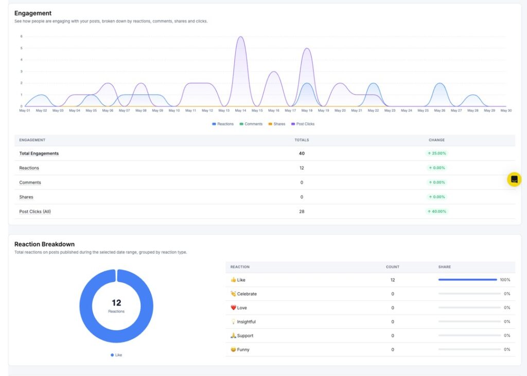
Engagement
The Engagement report shows how your audience interacted with your posts during the reporting period. The chart breaks your total engagement into:
- Reactions
- Comments
- Shares
- Post Clicks
Below the chart, a table shows totals and period-over-period change for each type.
Reaction Breakdown
The Reaction Breakdown report shows a donut chart of your total reactions split by type. The table on the right gives exact counts and percentages for each reaction.
If a single reaction type dominates, that tells you what emotional tone your content is landing on most.
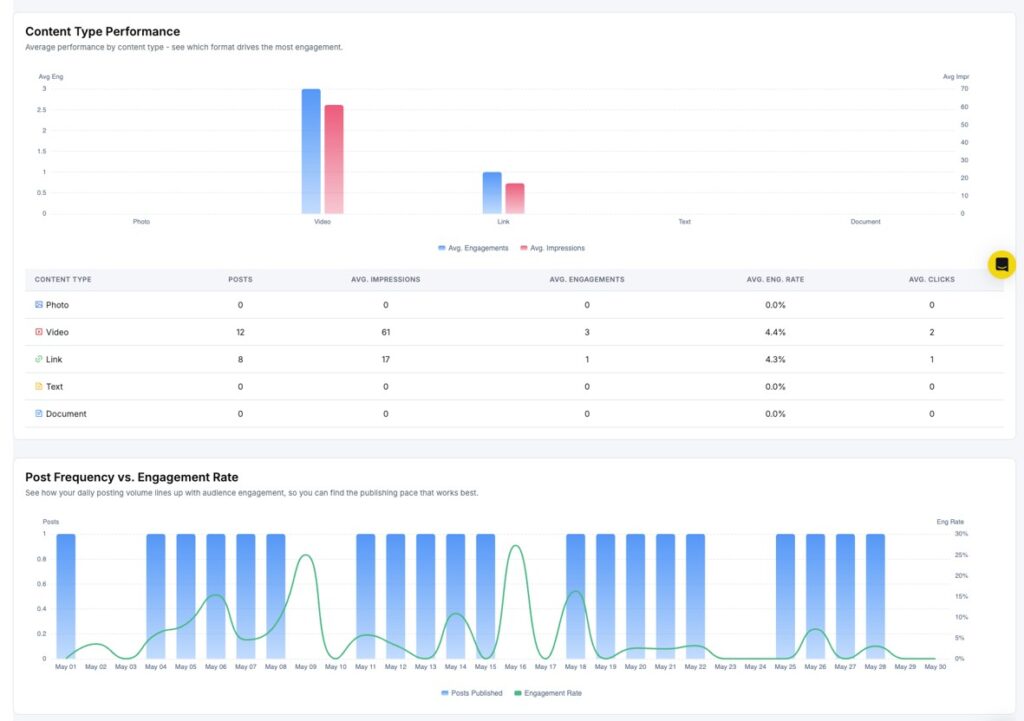
Content Performance Comparison
The Content Performance Comparison chart shows how different post types – Image, Video, Text, Link, and Document perform against each other.
Two bars are shown per content type: average impressions and average engagements. This helps you spot which format earns the most visibility and interaction, so you can post more of what works.
Post Frequency vs Engagement Rate
The Post Frequency vs Engagement Rate report overlays your daily publishing activity against your daily engagement rate. Use this to find whether posting more often helps or hurts engagement on your Page.
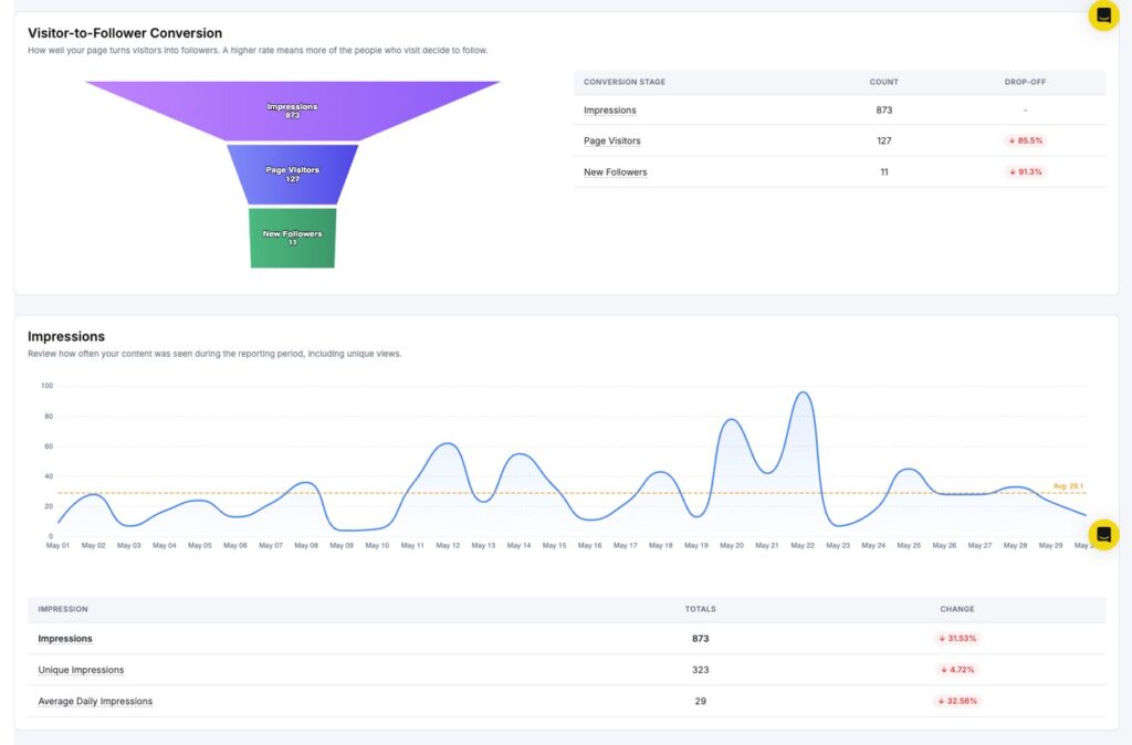
Follower/Following Funnel
The Follower/Following Funnel tracks how your audience moves from impressions through to engagement and follower growth. It shows where your drop-offs happen at each stage.
Impressions Trend
The Impressions Trend chart plots your daily impression count across the selected period, with an average line for reference. Use this to track visibility growth over time.
Page Views
The Page Views report shows how many times your Company Page profile was visited during the selected period. A spike in page views often follows a viral post or a company announcement.
Publishing Behavior
The Publishing Behavior report shows how many posts you published during the selected period, broken down by content type.
Key metrics include:
- Total Published Posts: The overall number of posts published
- Published Images: Number of image posts
- Published Videos: Number of video posts
- Published Links: Number of link posts
- Published Text: Number of text-only posts
- Published Documents: Number of document posts
Each metric shows a percentage change vs. the previous period, helping you see how your content mix is shifting.
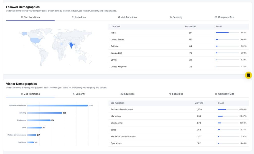
Audience Demographics
The Audience Demographics section shows the breakdown of your follower base by:
- Job Function
- Seniority
- Industry
- Company Size
- Location
Use this to check if your content is reaching the professional audience you are targeting on LinkedIn.
Video Demographics
The Video Demographics section shows the geographic distribution of viewers who watched your video content. It breaks down views by top countries and cities.
Follower Demographics
The Follower Demographics section gives a closer look at your follower base by age group and location. Use this to better understand who is following your Page and tailor content accordingly.
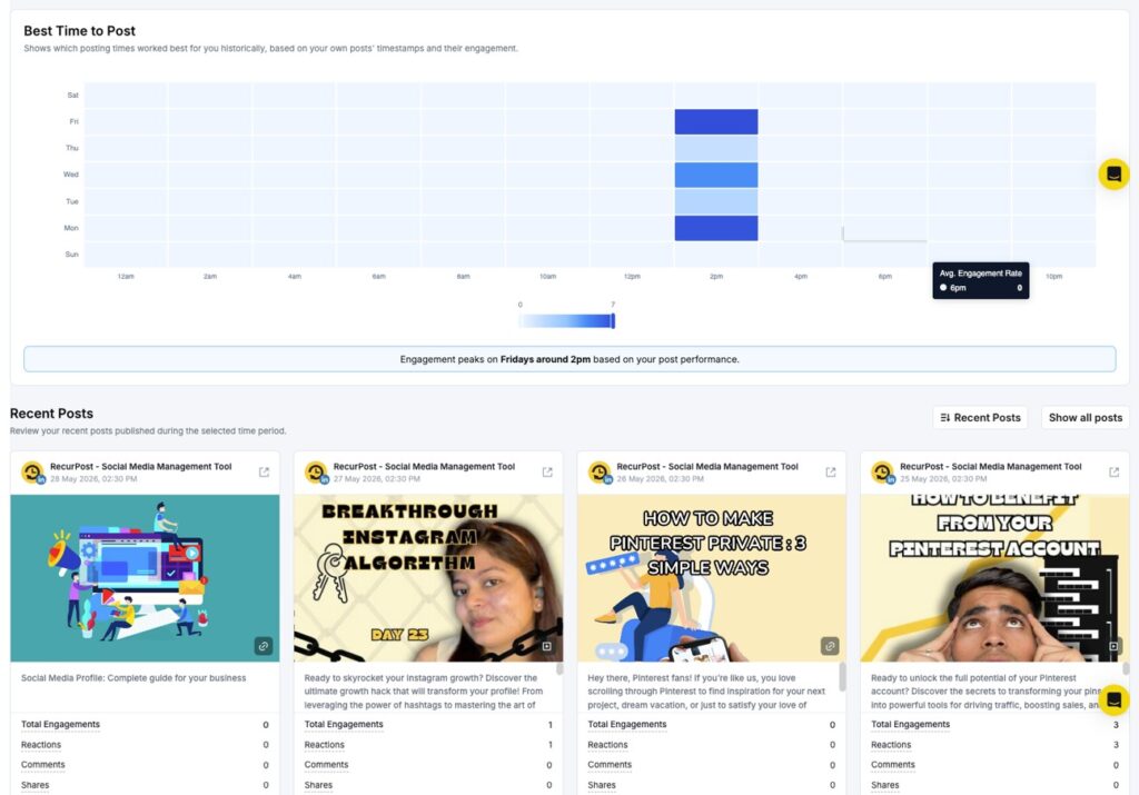
Best Time to Post
The Best Time to Post report shows a heatmap of your best posting windows, based on your own posts’ timestamps and their engagement. The grid plots days of the week on the Y-axis and hours of the day on the X-axis.
Darker cells indicate higher engagement during that time slot. Schedule your posts during those windows for the best chance at reaching more of your audience.
Recent Posts
The Recent Posts section shows the latest posts published during the selected period. Each postcard displays the post content, publish date and time, and its engagement breakdown, including total engagements, reactions, comments, shares, and post clicks.
Click Show all posts to see your full post history beyond the selected date range.
5. How to see TikTok Profile Analytics?
When you open your TikTok profile report, you see two things at the top: a Profile Overview and a Performance Snapshot.
Profile Overview
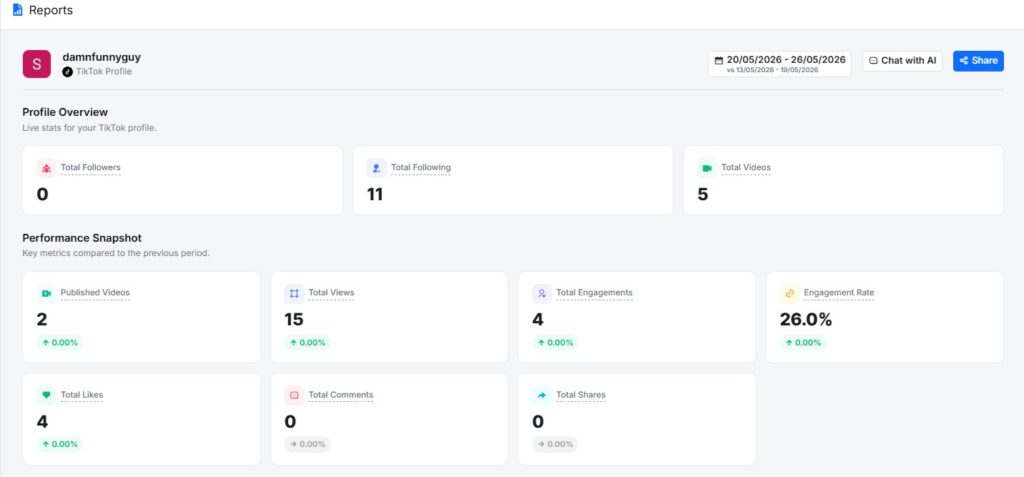
The Profile Overview shows live stats for your TikTok profile. It displays three numbers at a glance:
- Total Followers: How many people follow your account
- Total Following: How many accounts do you follow
- Total Videos: The total number of videos on your profile
Performance Snapshot
The Performance Snapshot sits just below the Profile Overview. It compares your key metrics from the selected date range against the previous period.
Metrics shown include:
- Published Videos: How many videos have you posted in the period
- Total Views: The total number of times your videos were watched
- Total Engagements: Combined likes, comments, and shares
- Engagement Rate: Engagements as a percentage of views
- Total Likes: Total likes received
- Total Comments: Total comments received
- Total Shares: Total shares received
Each metric shows a percentage change with a green arrow (up), red arrow (down), or grey arrow (no change). This tells you at a glance whether your performance went up or down compared to the last period.
Engagement Rate
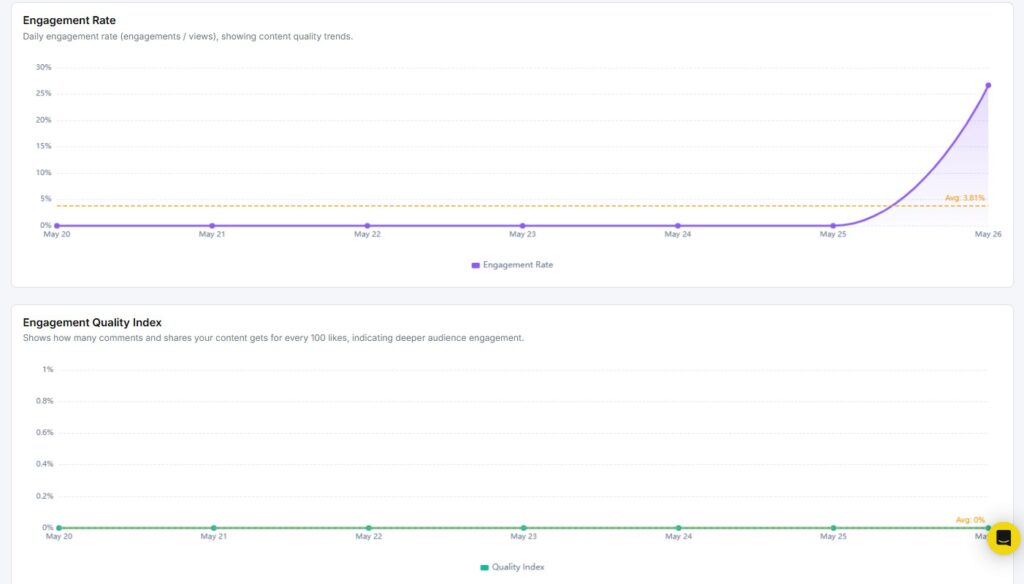
The Engagement Rate report shows the daily engagement rate across your selected period. It is calculated as engagements divided by views.
The graph plots your daily rate as a line, with an average line shown in orange for quick reference. Use this to spot which days your content got the most attention.
Engagement Quality Index
The Engagement Quality Index goes one step deeper than basic engagement. It measures how many comments and shares your content gets for every 100 likes.
Likes are passive. Comments and shares take more effort from viewers. A higher Quality Index means your audience is truly connecting with your content, not just scrolling past and tapping like.
Viral Potential
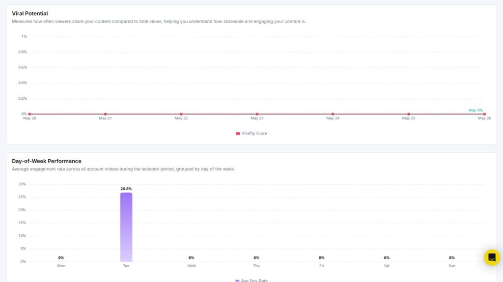
The Viral Potential report measures how often viewers share your content compared to total views. This is your virality score.
A higher score means more people are passing your videos along to others. If your Viral Potential is low, it may be worth testing content that sparks a reaction, tells a story, or gives viewers a reason to share.
Day-of-Week Performance
The Day-of-Week Performance report shows your average engagement rate for each day of the week — Monday through Sunday across all videos published in the selected period.
Use this to find out which days your audience is most active. If Tuesday consistently shows higher engagement than other days, that is a signal to post more on Tuesdays.
Engagement
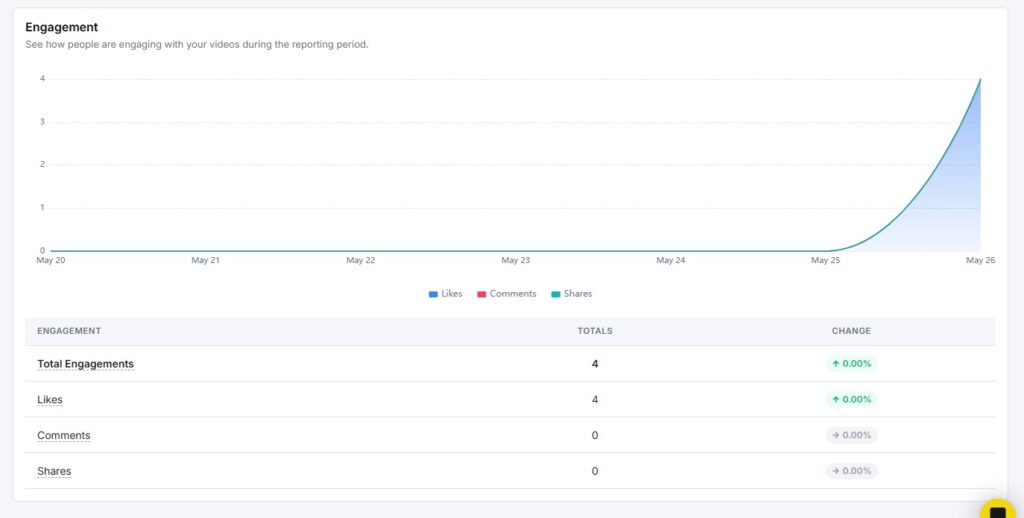
The Engagement report shows how your audience interacted with your videos over time. The area chart at the top breaks your engagement into three layers:
- Likes (blue)
- Comments (red)
- Shares (teal)
Below the chart, a table shows:
- Total Engagements: The combined count of all interactions
- Likes: Total likes with period-over-period change
- Comments: Total comments with period-over-period change
- Shares: Total shares with period-over-period change
The percentage change column tells you whether each metric went up, down, or stayed flat compared to the previous period.
Engagement Composition
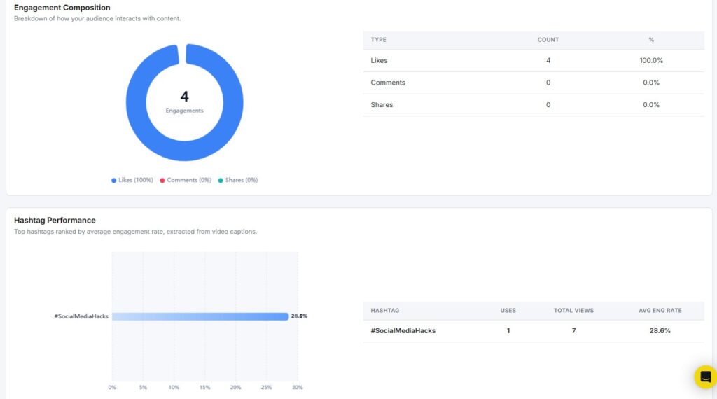
The Engagement Composition report breaks down your total engagements into a donut chart. It shows what percentage of your engagement came from likes, comments, and shares.
The table on the right gives you the exact count and percentage for each type:
- Likes
- Comments
- Shares
If likes make up 100% of your engagement with no comments or shares, your content may be getting passive reactions. Aim for a mix that includes comments and shares for a stronger audience connection.
Hashtag Performance
The Hashtag Performance report ranks your hashtags by average engagement rate. The data is pulled from the captions of your published videos.
The bar chart shows each hashtag and its engagement rate at a glance. The table on the right gives you three numbers for each hashtag:
- Uses: How many times have you used the hashtag
- Total Views: Views across videos using that hashtag
- Avg Eng. Rate: The average engagement rate for those videos
Use this report to find which hashtags are actually driving results and which ones are not worth using.
Mention Network
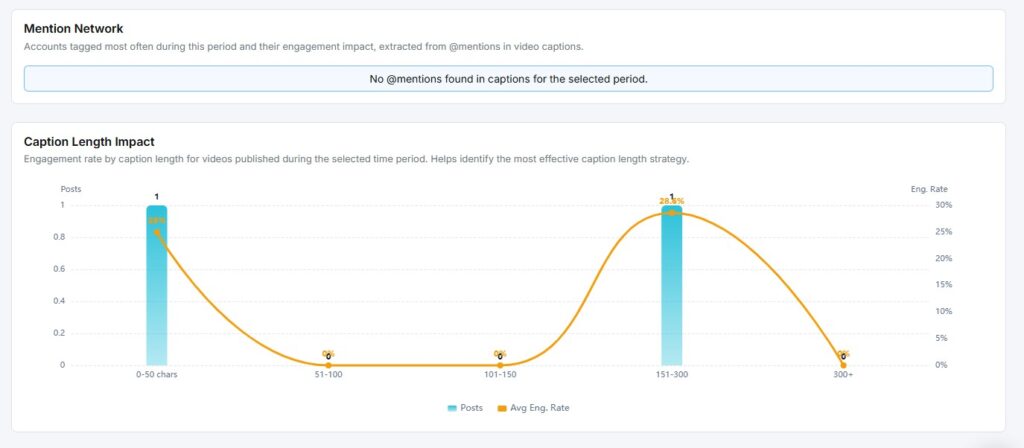
The Mention Network report shows which accounts you tagged most often in your video captions and what engagement impact those mentions had.
If no @mentions were found in your captions for the selected period, the report will show a message saying so. Once you start tagging other accounts, this report will track how those tags affect your reach and engagement.
Caption Length Impact
The Caption Length Impact report shows how the length of your video captions affects engagement rate. Caption lengths are grouped into five buckets:
- 0–50 characters
- 51–100 characters
- 101–150 characters
- 151–300 characters
- 300+ characters
The chart overlays two data points for each bucket: the number of posts (blue bars) and the average engagement rate (orange line). This helps you find the caption length that consistently drives the most engagement for your content.
Video Duration Analysis
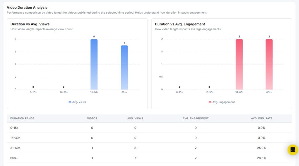
The Video Duration Analysis report shows how your video length affects performance. It groups your videos into four duration ranges:
- 0–15 seconds
- 16–30 seconds
- 31–60 seconds
- 60+ seconds
Two side-by-side charts display the data:
- Duration vs Avg. Views: Which video length gets the most views on average
- Duration vs Avg. Engagement: Which video length drives the most engagement on average
A summary table below the charts shows each duration range with the number of videos, average views, average engagement, and average engagement rate. Use this to find the sweet spot between video length and audience response.
Publishing Behavior
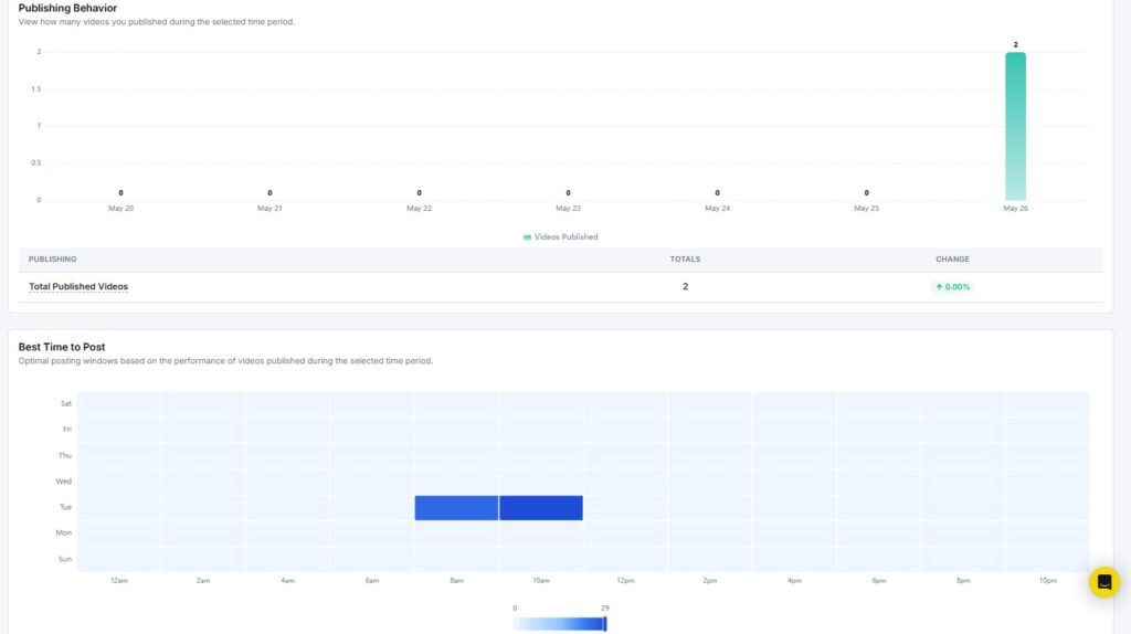
The Publishing Behavior report shows how many videos you published each day during the selected period. The bar chart plots your daily publishing activity, with a summary table below showing:
- Total Published Videos: The total count for the period
- Change: Whether that count went up or down compared to the previous period
Use this to spot gaps in your posting schedule and keep a steady publishing rhythm.
Best Time to Post
The Best Time to Post report shows a heatmap of optimal posting windows based on how your past videos performed. The grid plots days of the week on the Y-axis and hours of the day on the X-axis.
Darker blue cells indicate higher engagement during that time slot. If Tuesday mornings between 8 am and 10 am consistently show strong performance, those are your best windows to publish new videos.
Aspect Ratio Performance
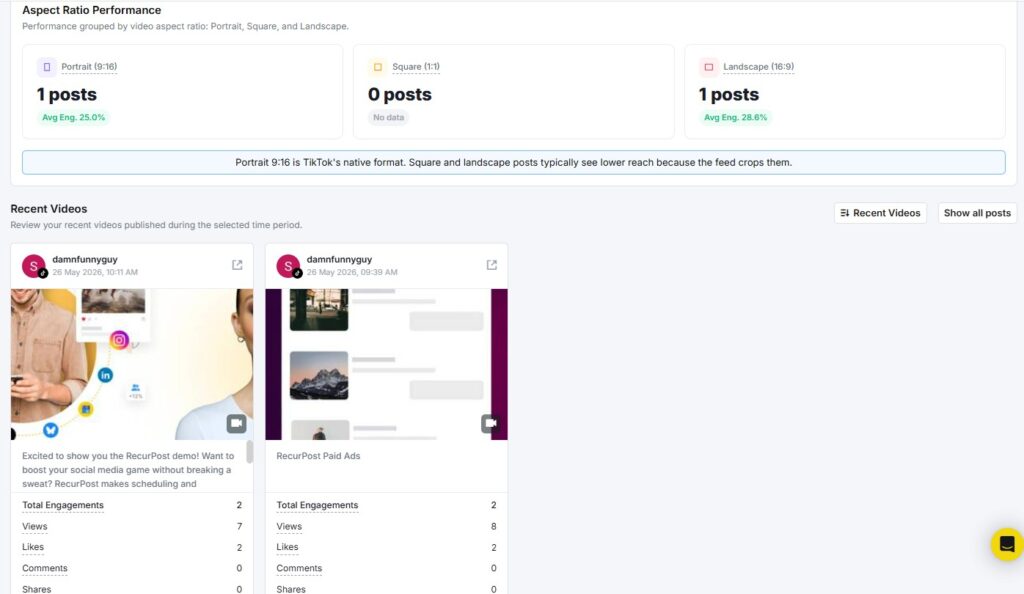
The Aspect Ratio Performance report groups your videos by format and shows how each format performs:
- Portrait (9:16): TikTok’s native vertical format
- Square (1:1): Equal width and height
- Landscape (16:9): Horizontal format
Each format card shows the number of posts and the average engagement rate. A note at the bottom of this section reminds you that Portrait 9:16 is TikTok’s native format, and square or landscape videos typically get lower reach because TikTok’s feed crops them.
Recent Videos
The Recent Videos section shows the latest videos you published during the selected period. Each video card displays:
- Video thumbnail and caption
- Total Engagements
- Views
- Likes
- Comments
- Shares
You can click Show all posts to see your full video history beyond the selected period.
6. How to see Pinterest Analytics?
When you open your Pinterest report, you see two things at the top: a Profile Overview and a Performance Snapshot.
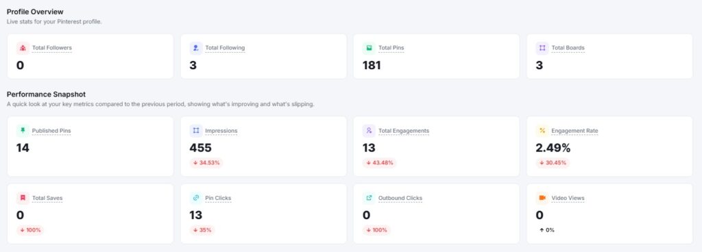
Profile Overview
The Profile Overview shows live stats for your Pinterest account. It displays four numbers at a glance:
- Total Pins: The total number of Pins on your account
- Total Boards: How many boards do you have
- Total Followers: How many people follow your account
- Total Following: How many accounts do you follow
Performance Snapshot
The Performance Snapshot sits just below the Profile Overview. It compares your key metrics from the selected date range against the previous period.
Metrics shown include:
- Published Pins: How many Pins did you post in the period
- Total Impressions: How many times your Pins appeared on screen
- Total Engagements: Combined saves, Pin clicks, and outbound clicks
- Engagement Rate: Engagements as a percentage of impressions
- Total Saves: How many times have users saved your Pins
- Pin Clicks: How many times users clicked on your Pins
- Outbound Clicks: How many times users clicked a link out of Pinterest
Each metric shows a percentage change with a green (up), red (down), or grey (no change) label. This tells you at a glance whether performance improved or dropped compared to the last period.
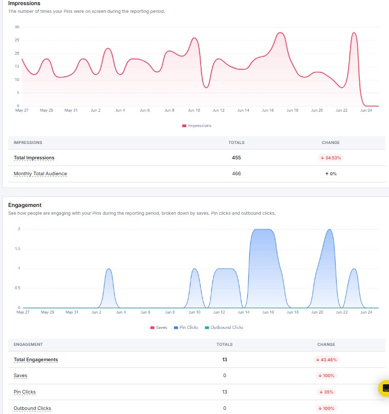
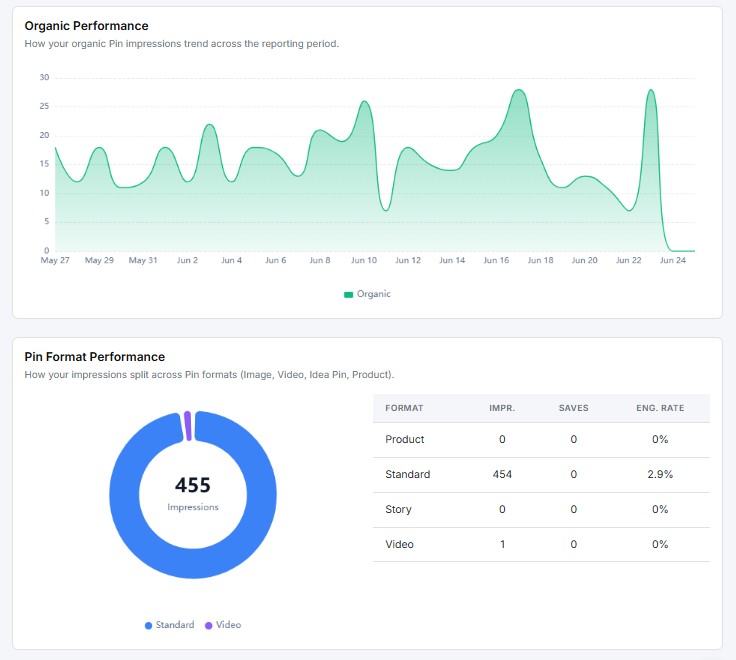
Impressions
The Impressions report shows how many times your Pins appeared on users’ screens during the selected period. The graph plots your daily impression count with an average line for quick reference.
Key metrics include:
- Total Impressions: The overall number of times your content was displayed
- Avg. Daily Impressions: The average impressions per day across the period
Engagement
The Engagement report shows how users interacted with your Pins over the selected period. The area chart breaks your engagement into three layers:
- Saves: Users who saved your Pins to their boards
- Pin Clicks: Users who clicked to open your Pin
- Outbound Clicks: Users who clicked through to an external link
Below the chart, a table shows totals and period-over-period change for each type.
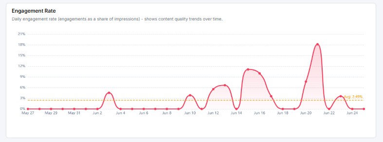
Engagement Rate
The Engagement Rate report tracks your daily engagement rate across the selected period. It is calculated as engagements divided by impressions.
The graph plots your daily rate as a line, with an average line for reference. Use this to spot which days your Pins connected best with your audience.
Engagement Composition
The Engagement Composition report breaks your total engagements into a donut chart. It shows what percentage of interactions came from saves, Pin clicks, and outbound clicks.
A high share of outbound clicks means your Pins are driving traffic off Pinterest. A high share of saves means your content is being bookmarked for later both are strong signals for different goals.
Board Performance
The Board Performance report shows how each of your boards is performing during the selected period.
Metrics shown per board include:
- Pins: Total number of Pins on the board
- Followers: Number of followers on that board
- Impressions: How many times were Pins on the board seen
- Saves: How many times Pins were saved from the board
- Pin Clicks: How many times Pins on the board were clicked
- Outbound Clicks: How many external link clicks came from the board
Use this to see which boards are driving the most visibility and traffic.
Pin Performance
The Pin Performance table lists your individual Pins with their metrics side by side.
Metrics shown per Pin include:
- Total Saves
- Impressions
- Pin Clicks
- Outbound Clicks
- Date Posted
Sort by any column to find your top-performing Pins or spot content that needs attention.
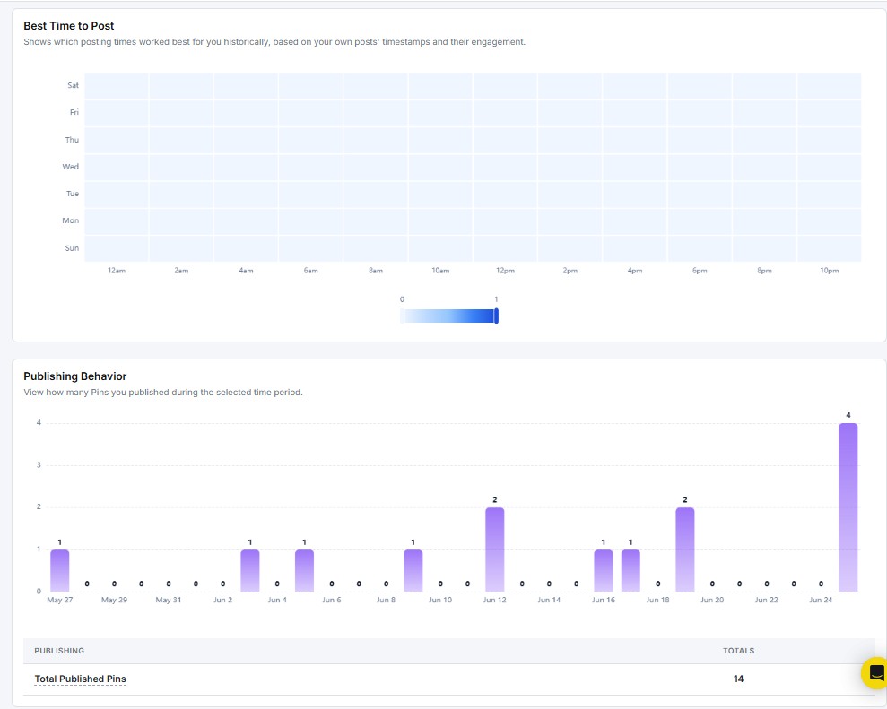
Best Time to Post
The Best Time to Post report shows a heatmap of optimal posting windows based on how your past Pins performed. The grid plots days of the week on the Y-axis and hours of the day on the X-axis.
Darker cells indicate higher engagement during that time slot. Schedule your Pins during those windows to reach more of your audience when they are most active.
Publishing Behavior
The Publishing Behavior report shows how many Pins you published each day during the selected period.
Key metric:
- Total Published Pins: With a percentage change vs. the previous period
Use this to spot gaps in your posting schedule and keep a steady publishing rhythm.
Recent Pins
The Recent Pins section lists the latest Pins you published during the selected period. Each Pin card displays:
- Pin thumbnail and caption
- Total Saves
- Impressions
- Pin Clicks
- Outbound Clicks
- Date Posted
Click Show all posts to see your full Pin history beyond the selected date range.
7. How to see YouTube Analytics?
When you open the YouTube report, you see two things at the top: a Channel Overview and a Performance Snapshot.
Channel Overview
The Channel Overview shows lifetime stats for your YouTube channel. These numbers stay the same no matter which date range you pick.
It displays four key metrics at a glance:
- Subscribers: Total subscribers on your channel
- Total Videos: Number of videos you’ve published
- Total Views: Cumulative views across all videos
- Total Watch Time (Hours): Total hours your content has been watched
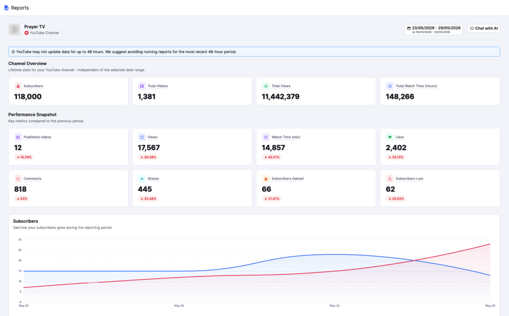
Performance Snapshot
The Performance Snapshot sits just below the Channel Overview. It compares your key metrics from the selected date range against the previous period.
Metrics shown include:
- Published Videos: How many videos have you posted in the period
- Views: Total views for the selected range
- Watch Time (min): Total watch time in minutes
- Likes: Total likes received
- Comments: Total comments received
- Shares: Total shares
- Subscribers Gained: New subscribers added
- Subscribers Lost: Subscribers who left
Each metric shows a percentage change with a red arrow (down) or green arrow (up). This tells you at a glance how your channel performed vs. the last period.
Subscribers
The Subscribers section shows how your subscriber count moved during the reporting period. Two lines on the chart track daily subscribers gained (red) and lost (blue).
You can spot exactly when your subscriber growth spiked or dipped. If the lines cross, that’s a signal to check what content you posted that day.
Below the chart, a table shows:
- Subscribers Gained: Total new subscribers with period-over-period change
- Subscribers Lost: Total lost subscribers with period-over-period change
Net Subscriber Growth
The Net Subscriber Growth chart shows the daily net change in subscribers, that’s subscribers gained minus subscribers lost.
A bar above zero means you added more than you lost that day. Use this to spot your best and worst days for subscriber growth.
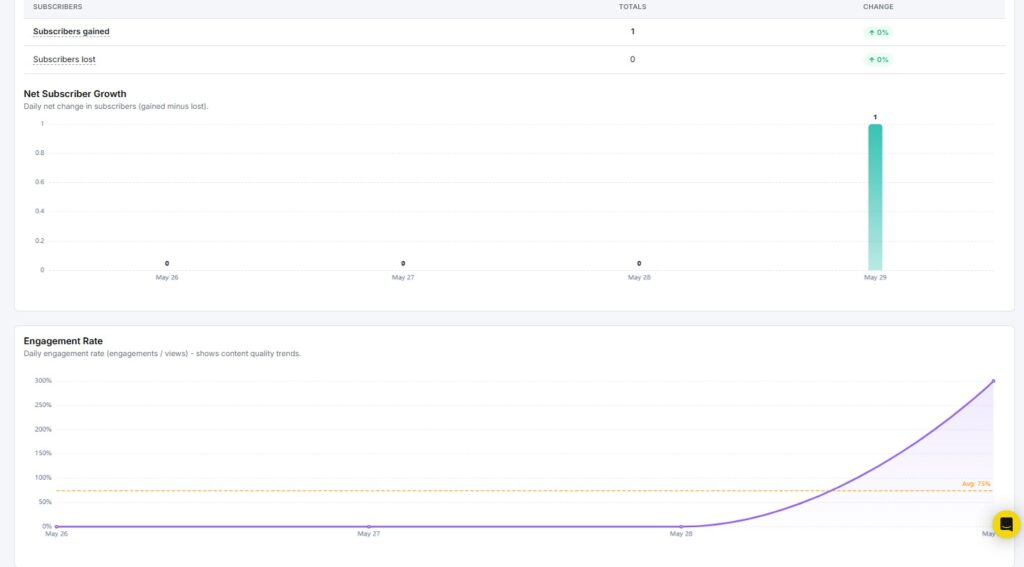
Engagement Rate
The Engagement Rate report tracks your daily engagement rate across the selected period. It’s calculated as total engagements divided by total views.
The graph plots your daily rate as a line, with an average line shown in orange for quick reference. Use this to find which days your content got the most attention from viewers.
Conversion Funnel
The Conversion Funnel shows how viewers move from impressions all the way to becoming subscribers. It tracks four stages:
- Views: Total views in the period
- Engaged Views: Views where the viewer actually interacted
- Engagements: Total interactions (likes, comments, shares)
- Subscribers Gained: New subscribers from this period
The drop-off percentage next to each stage tells you where you’re losing people. A big drop between Engaged Views and Subscribers Gained means your content holds attention, but isn’t pushing viewers to subscribe.
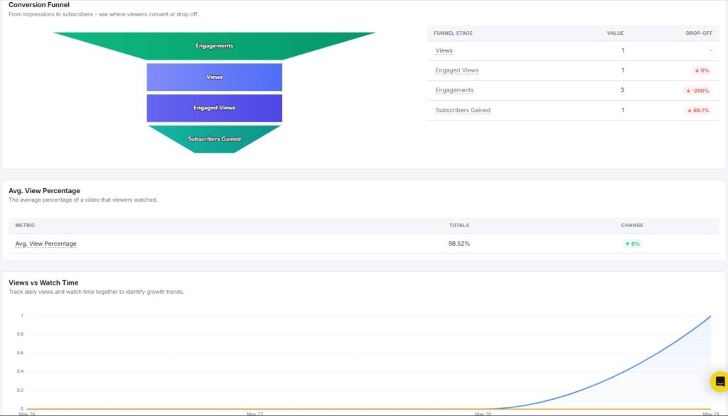
Avg. View Percentage
The Avg. View Percentage shows the average portion of a video that viewers actually watched. A higher percentage means people are staying till the end.
This is one of the strongest signals of content quality. If your score is below 50%, your videos may be losing viewers too early.
Views vs Watch Time
The Views vs Watch Time chart tracks daily views and watch time together. You can spot growth trends when both lines move up at the same time.
If views go up but watch time stays flat, viewers may be clicking away quickly. That’s a cue to tighten up your video hooks.
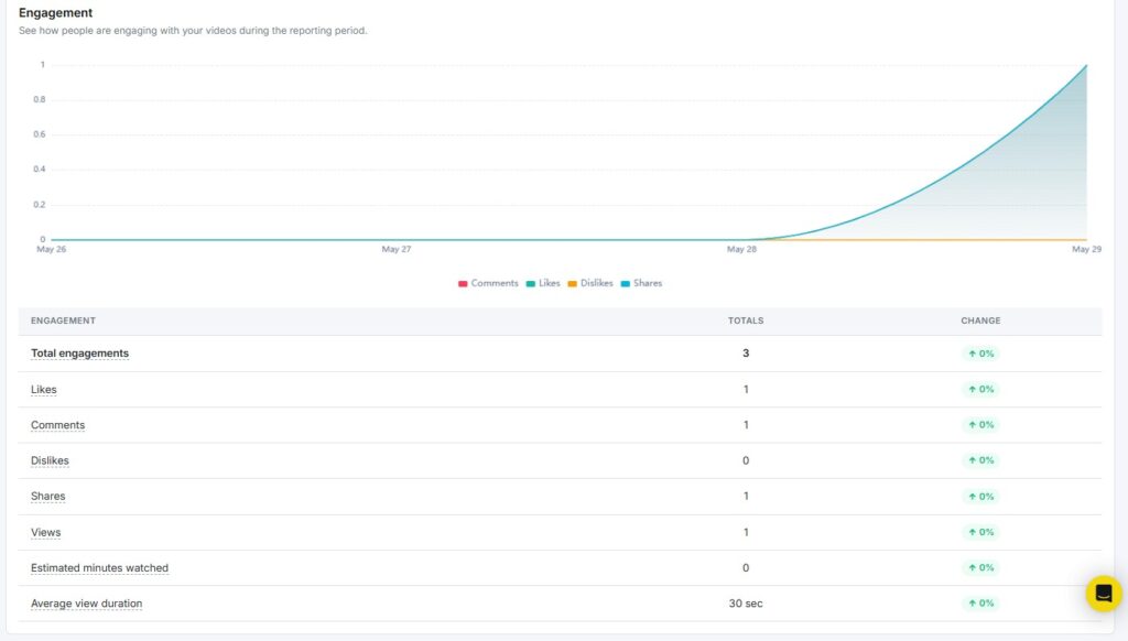
Engagement
The Engagement section shows how viewers interacted with your videos during the reporting period. The area chart at the top tracks comments, likes, dislikes, and shares over time.
Below the chart, a table shows totals for each metric:
- Total Engagements: Combined count of all interactions
- Likes: Total likes with period-over-period change
- Comments: Total comments with period-over-period change
- Dislikes: Total dislikes
- Shares: Total shares with period-over-period change
- Views: Total views
- Estimated Minutes Watched: Total watch time in minutes
- Average View Duration: Average seconds or minutes a viewer spent watching
Best Time to Post
The Best Time to Post report shows a heatmap of optimal posting windows based on past video performance. The grid plots days of the week on the Y-axis and hours of the day on the X-axis.
Darker cells indicate higher engagement during that time slot. If Monday mornings between 10 am and 12 pm show strong results, those are your best windows to publish.
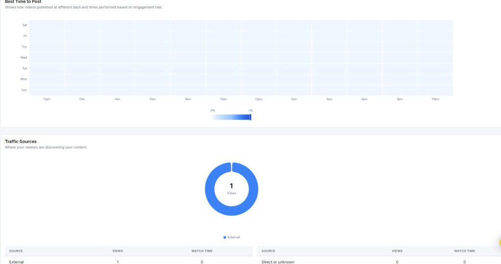
Traffic Sources
The Traffic Sources section shows where your viewers are coming from. It breaks down views and watch time by source.
Sources tracked include:
- External: Traffic from outside YouTube (websites, social media)
- Direct or Unknown: Viewers who came directly without a traceable source
Use this to see which channels are driving the most traffic to your videos.
Content Type Breakdown
The Content Type Breakdown shows how your views split across different video formats – Shorts, long-form videos, and live streams.
The donut chart gives you a quick visual of which format dominates your views. The table below breaks it down with exact numbers for views, likes, and shares per content type.
Content Performance Comparison
The Content Performance Comparison chart compares views, likes, and shares across content types side by side. Each content type gets a set of three bars.
This makes it easy to see not just which format gets the most views, but which one actually drives engagement.
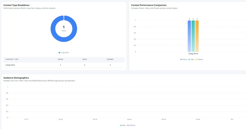
Audience Demographics
The Audience Demographics chart shows how your views are distributed across age groups and genders. Age groups run from 13-17 all the way to 65+.
Two lines – one for men, one for women show the breakdown for each age group. Use this to check if your content is reaching the audience you’re aiming for.
Subscriber Sources
The Subscriber Sources section shows where your new subscribers are coming from.
Sources are broken into:
- External: Subscribers gained from outside YouTube
- Direct or Unknown: Subscribers with no traceable source
The table shows both gained and lost subscribers for each source, so you can see the net impact by channel.
Device Breakdown
The Device Breakdown shows what devices your audience uses to watch your content – desktop, mobile, tablet, or TV.
Most YouTube viewers watch on mobile. If your channel skews toward desktop, that may shape how you format thumbnails and captions.
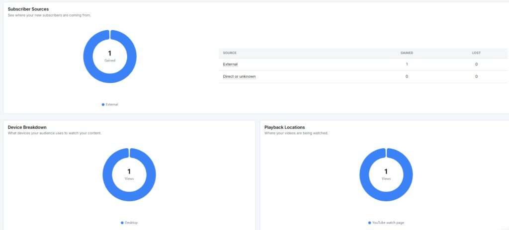
Playback Locations
The Playback Locations section shows where your videos are being watched. The main option is the YouTube watch page, but videos can also play on embedded external sites.
Knowing where playback happens helps you decide where to share your content for maximum reach.
Subscribed vs Unsubscribed Viewers
The Subscribed vs Unsubscribed Viewers chart shows how much of your viewership comes from subscribers versus non-subscribers.
A high non-subscriber view share is a good thing — it means new people are finding your content. A low share means your audience is mostly existing subscribers, which may signal limited discovery.
Sharing Services
The Sharing Services section shows where people are sharing your videos. The most common source here is Copy-Paste, viewers copying the link and sharing it manually.
Other services may appear here as more data comes in over time.
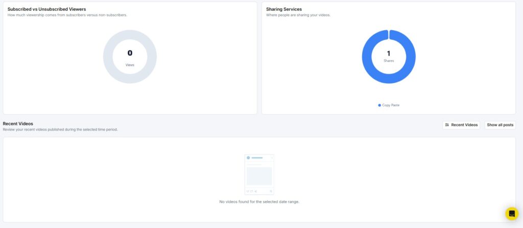
Recent Videos
The Recent Videos section lists the latest videos you published during the selected period. Each video card shows:
- Video title
- Total engagements
- Views
- Likes
- Comments
- Shares
Click Show all posts to see your full video history beyond the selected date range.
Note: With YouTube’s latest policy update, only data from the past 15 days is accessible in YouTube Reports. Downloading reports and viewing post history details, such as likes, comments, and views, are now restricted. These changes are reflected in RecurPost’s YouTube reporting features.
8. How to see Threads Analytics?
When you open your Threads report, you see two things at the top: a Profile Overview and a Performance Snapshot.
Performance Snapshot
The Performance Snapshot shows your key Threads metrics for the selected date range, compared against the previous period.
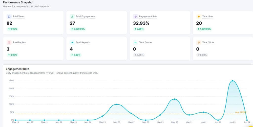
Metrics shown include:
- Total Views: How many times your posts were seen
- Total Engagements: Combined likes, replies, reposts, and quotes
- Engagement Rate: Engagements as a percentage of views
- Total Likes: Total likes received across all posts
Each metric shows a percentage change, so you can quickly see whether performance went up or down.
Engagement Rate
The Engagement Rate report tracks your daily engagement rate across the selected period. It is calculated as engagements divided by views.
The graph plots your daily rate as a line, with an average line shown for quick reference. Use this to spot which days your content got the most attention.
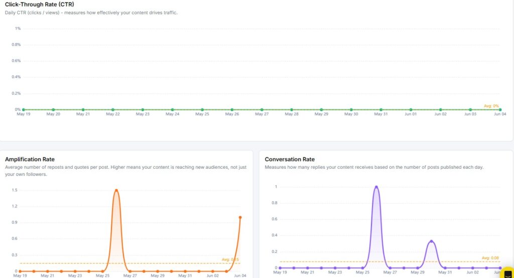
Click-Through Rate (CTR)
The CTR report shows the daily ratio of clicks to views. It tells you how well your posts are driving traffic to external links.
A flat CTR at 0% means none of your posts included clickable links that drove traffic, or that the links weren’t clicked. Add calls-to-action with links to push this number up.
Amplification Rate
The Amplification Rate measures how often your content gets reposted or quoted per post published each day.
A higher rate means your audience is actively spreading your content. If the rate stays low, try posting content that gives people a reason to share – strong opinions, useful tips, or timely news.
Conversation Rate
The Conversation Rate tracks how many replies your posts receive per post published each day.
More replies signal that your content is sparking real discussions. If this number is low, ask questions or post takes that invite a response.
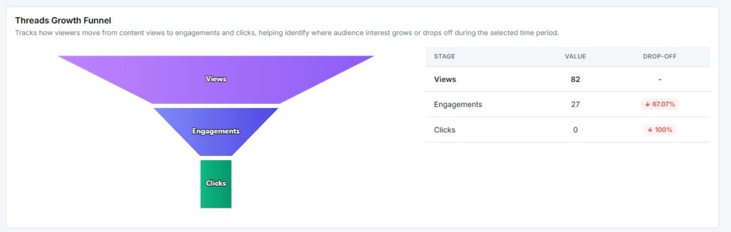
Threads Growth Funnel
The Growth Funnel tracks how viewers move through three stages:
| Stage | What It Means |
|---|---|
| How many times have your posts been seen | How many times have your posts been seen |
| Engagements | How many people interacted |
| Clicks | How many clicked a link |
The drop-off percentage next to each stage shows where you’re losing your audience. A high drop from Views to Engagements means people are scrolling past without reacting.
Reach Rate Trend
The Reach Rate Trend shows your daily views relative to your follower count. A higher rate means your content is reaching people beyond your own followers.
The chart compares the current period against the previous one. If both your current and comparison periods show 0%, it may be because your follower count is 0. Threads require followers to calculate the reach rate.
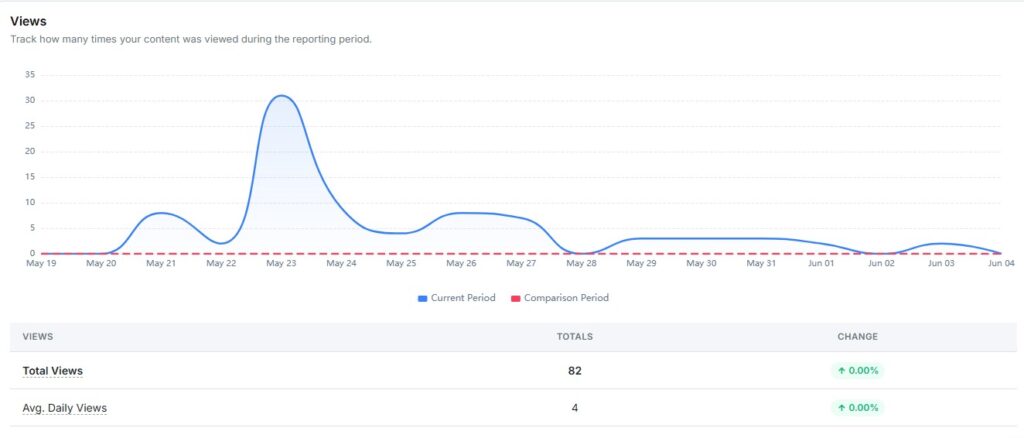
Views
The Views report tracks how many times your content was seen during the reporting period.
Key metrics:
- Total Views: The overall view count for the period
- Avg. Daily Views: The average number of views per day
The chart compares your current period against the previous one so you can spot growth or drops at a glance.
Link Click Performance
The Link Click Performance report shows how many clicks your shared URLs received.
Key metrics:
- Total Clicks: The total number of link clicks
- Click-Through Rate: Clicks as a percentage of views
Zero clicks across the board means your posts aren’t driving off-platform traffic yet. Adding links with clear reasons to click will move this number.
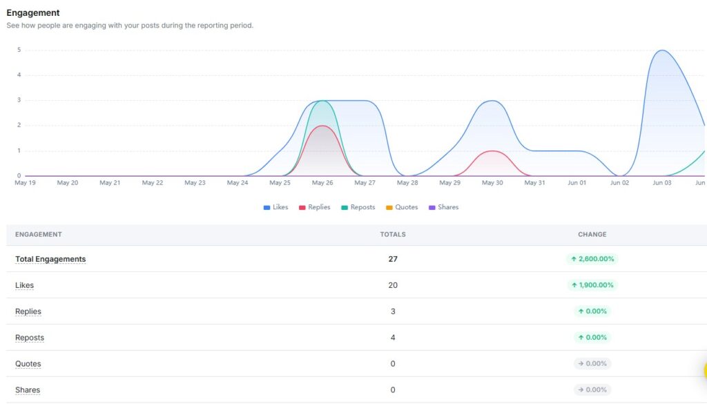
Engagement
The Engagement report shows how your audience interacted with your posts during the reporting period.
Engagement metrics include:
- Total Engagements: All interactions combined
- Likes: Posts people liked
- Replies: Comments on your posts received
- Reposts: Times your content was reshared
- Quotes: Times someone quoted your post with their own comment
- Shares: Times your post was shared directly
The chart breaks these down by day so you can see exactly when activity spiked.
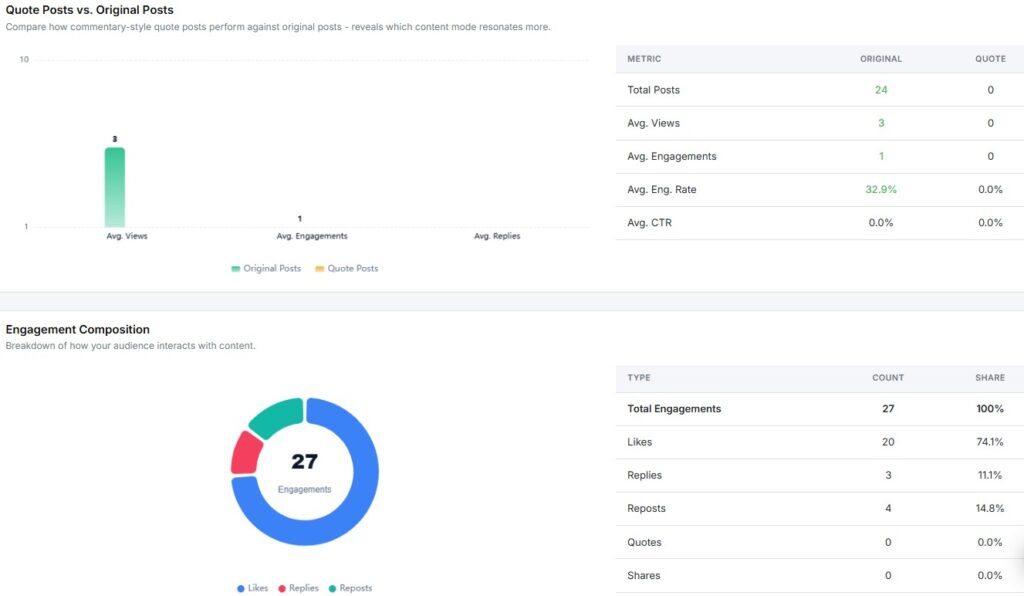
Quote Posts vs. Original Posts
The Quote Posts vs. Original Posts report compares how commentary-style quote posts perform against your original posts.
Metrics compared side by side:
- Total Posts
- Avg. Views
- Avg. Engagements
- Avg. Engagement Rate
- Avg. CTR
If you haven’t published any quote posts yet, only original post data will show. Try quoting relevant threads in your niche to see if that format resonates with your audience.
Engagement Composition
The Engagement Composition report breaks your total engagements into a donut chart. It shows what share of interactions came from likes, replies, and reposts.
The table on the right gives exact counts and percentages for each type. If likes make up nearly all of your engagement with zero replies or reposts, your content is getting passive reactions. Aim for a mix that includes replies for a stronger connection.
Audience Demographics
The Audience Demographics section shows the age and gender breakdown of your followers.
Note: A minimum of 100 followers is required for this data to appear. Once your account reaches that threshold, this report will show age groups (13–17 through 55+) split by men and women.
Audience Location
The Audience Location report shows the top countries and cities where your followers live.
Note: Like Demographics, this requires a minimum of 100 followers. Use this data to make decisions about posting times and regional content once it becomes available.
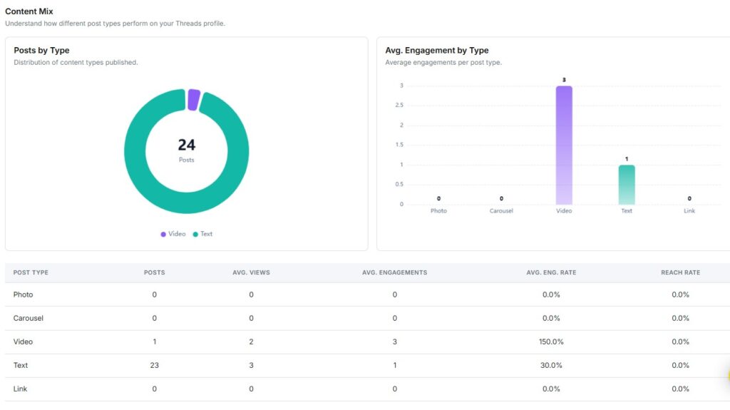
Content Mix
The Content Mix section shows two things:
- Posts by Type: A donut chart of how many posts were Video vs. Text vs. other formats
- Avg. Engagement by Type: A bar chart showing which format drives the most engagement on average
Video posts tend to earn higher average engagement even with fewer posts. Text posts dominate in volume but get lower per-post interaction. Use this to decide where to shift your content focus.
Content Performance by Type
The Content Performance by Type table breaks down each format – Photo, Carousel, Video, Text, Link with these metrics:
- Posts published
- Avg. Views
- Avg. Engagements
- Avg. Engagement Rate
- Reach Rate
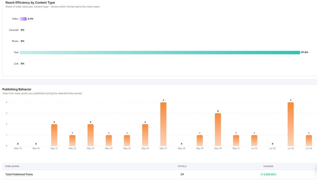
Reach Efficiency by Content Type
The Reach Efficiency chart shows each content type’s share of your total views. It tells you which format is pulling the most visibility.
Text posts typically dominate reach on Threads since most content is text-based. But a single video post can outperform on engagement rate even with fewer total views.
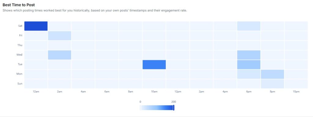
Publishing Behavior
The Publishing Behavior report shows how many posts you published each day during the selected period. The bar chart makes it easy to spot gaps in your posting schedule.
Key metric:
- Total Published Posts: With a percentage change vs. the previous period
Consistent posting keeps your profile active and gives the algorithm more content to serve to new viewers.
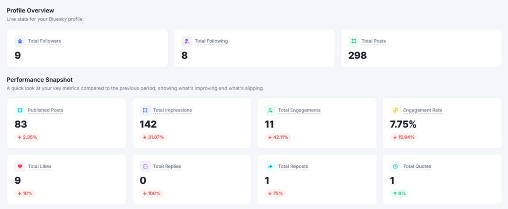
Best Time to Post
The Best Time to Post report shows which posting times have worked best for you based on your own post history and engagement rates.
The heatmap plots days of the week against hours of the day. Darker cells signal higher engagement during that window. Use this to schedule your next posts at your peak times.
Recent Posts
The Recent Posts section lists the latest posts published during the selected period. Each postcard shows:
- Post preview
- Total Engagements
- Likes
- Replies
- Reposts
- Quotes
- Shares
- Views
This gives you a quick post-by-post view of what performed well and what didn’t.
9. How to see Bluesky Analytics?
When you open your Bluesky report, you see two things at the top: a Profile Overview and a Performance Snapshot.
Profile Overview
The Profile Overview shows live stats for your Bluesky profile. It displays three numbers at a glance:
- Total Followers: How many people follow your account
- Total Posts: The total number of posts on your profile
- Profile Handle: Your Bluesky handle for quick reference
Performance Snapshot
The Performance Snapshot sits just below the Profile Overview. It compares your key metrics from the selected date range against the previous period.
Metrics shown include:
- Total Published Posts: How many posts have you published in the period
- Total Impressions: How many times your posts were seen
- Total Engagements: Combined likes, replies, reposts, and quotes
- Engagement Rate: Engagements as a percentage of impressions
- Total Likes: Total likes received
- Total Replies: Total replies received
- Total Reposts: Total reposts received
- Total Quotes: Total quotes received
Each metric shows a percentage change, so you can tell at a glance whether your numbers went up or down compared to the last period.

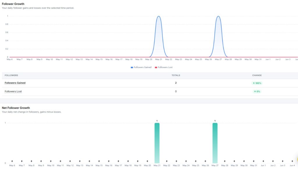
Follower Growth
The Follower Growth report shows daily follower gains and losses during the reporting period. A chart plots both lines side by side so you can spot exactly when you gained or lost followers.
Below the chart, a table shows:
- Followers Gained: Total new followers with period-over-period change
- Followers Lost: Total lost followers
- Net Change: Your overall follower gain or loss for the period
Net Follower Growth
The Net Follower Growth chart shows your daily net change in followers, that is, followers gained minus followers lost. A bar above zero means you added more than you lost that day.
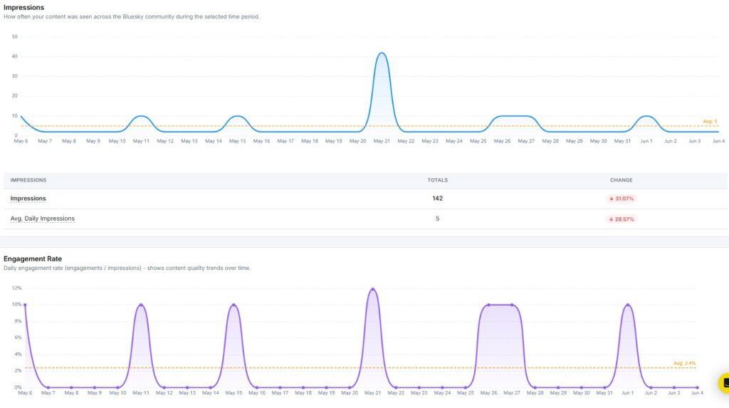
Impressions
The Impressions report shows how often your content was seen across the Bluesky community during the selected period. The graph plots daily impression counts with an average line for quick reference.
Key metrics include:
- Total Impressions: The total number of times your content was displayed
- Avg. Daily Impressions: The average number of impressions per day
Engagement Rate
The Engagement Rate report tracks your daily engagement rate across the selected period. It is calculated as total engagements divided by total impressions.
The graph plots your daily rate as a line, with an average line for reference. Use this to spot which days your content got the most attention.
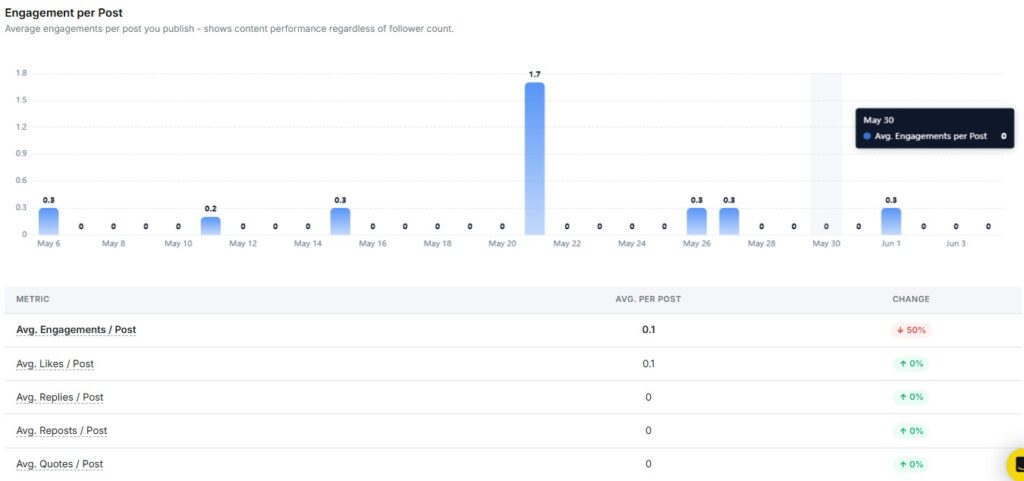
Average Engagement per Post
The Average Engagement per Post report shows how your content performs on a per-post basis, regardless of follower count.
Metrics shown include:
- Avg. Engagements / Post
- Avg. Likes / Post
- Avg. Replies / Post
- Avg. Reposts / Post
- Avg. Quotes / Post
Each metric also shows a period-over-period change, so you can track whether your per-post performance is improving.
Reply-to-Post Ratio
The Reply-to-Post Ratio shows how conversational your content is. A higher ratio means more people are responding to your posts rather than just viewing them. Use this to gauge how much discussion your content sparks.
Repost Amplification
The Repost Amplification report shows how far your content spreads beyond your direct followers. A rising repost rate means more people find your content worth sharing with their own audience.
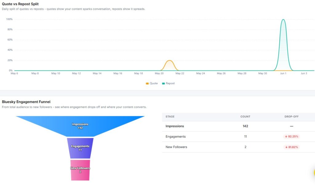
Quote vs Repost Split
The Quote vs Repost Split shows the daily split between quotes and reposts. Quotes mean your content sparked a conversation. Reposts mean it spread. Use this chart to understand whether your posts are driving reach, discussion, or both.
Bluesky Engagement Funnel
The Engagement Funnel shows how your audience moves from seeing your content to taking action. It tracks three stages:
- Impressions: Total times your content was seen
- Engagements: Total interactions (likes, replies, reposts, quotes)
- New Followers: Followers gained during the period
The drop-off percentage next to each stage tells you where you’re losing people. A large drop between Engagements and New Followers means your content gets reactions, but isn’t converting viewers into followers yet.
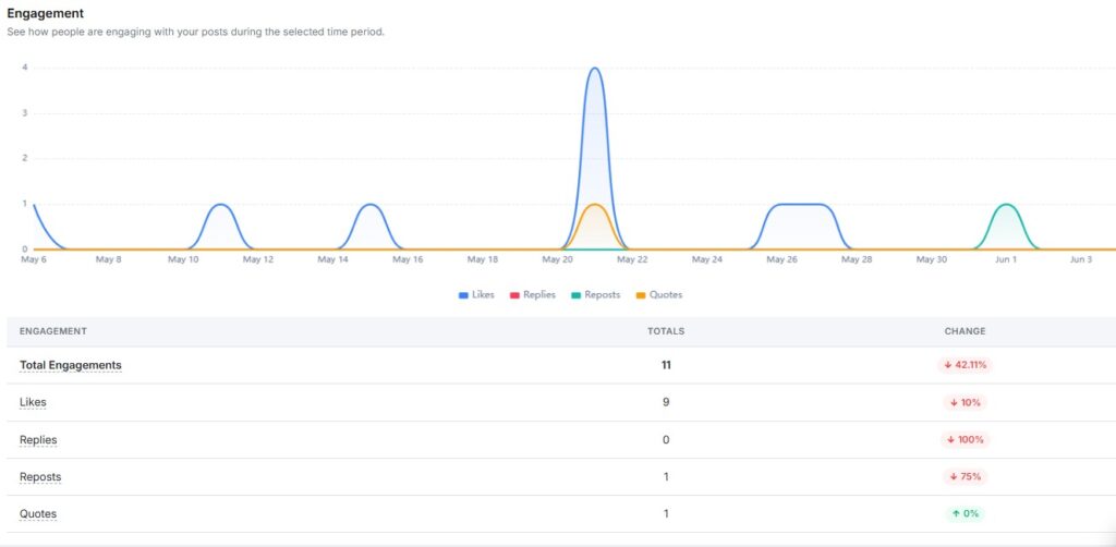
Engagement
The Engagement report shows how people interacted with your posts over time. The chart breaks your total engagement into four types:
- Likes
- Replies
- Reposts
- Quotes
Below the chart, a table shows totals and period-over-period change for each type.
Engagement Composition
The Engagement Composition report breaks your total engagements into a donut chart. It shows what share of your interactions came from likes, replies, reposts, and quotes.
If likes make up nearly all your engagement with zero replies or reposts, your content is getting passive reactions. A mix that includes replies and reposts signals a more active audience.
Content Type Performance
The Content Type Performance report shows your average engagement per post, split by content format. Formats tracked include:
- Photo
- Carousel
- Text
- Link
- Video
This helps you see which format drives the most engagement, so you can post more of what works.
Follower / Following Ratio
The Follower / Following Ratio tracks your daily ratio of followers to accounts you follow. A ratio above 1 means more people follow you than you follow back, which signals stronger account authority.
Metrics shown include:
- Avg. Ratio: Your average ratio across the period
- Peak Ratio: The highest ratio reached during the period
Publishing Behavior
The Publishing Behavior report shows how many posts you published during the selected period, broken down by content type.
Key metrics include:
- Total Published Posts: The total number of posts across all formats
- Photo Posts: Number of image posts
- Carousel Posts: Number of carousel posts
- Link Posts: Number of posts containing links
- Text Posts: Number of text-only posts
- Video Posts: Number of video posts
Each metric shows a percentage change, so you can track whether your posting activity went up or down.
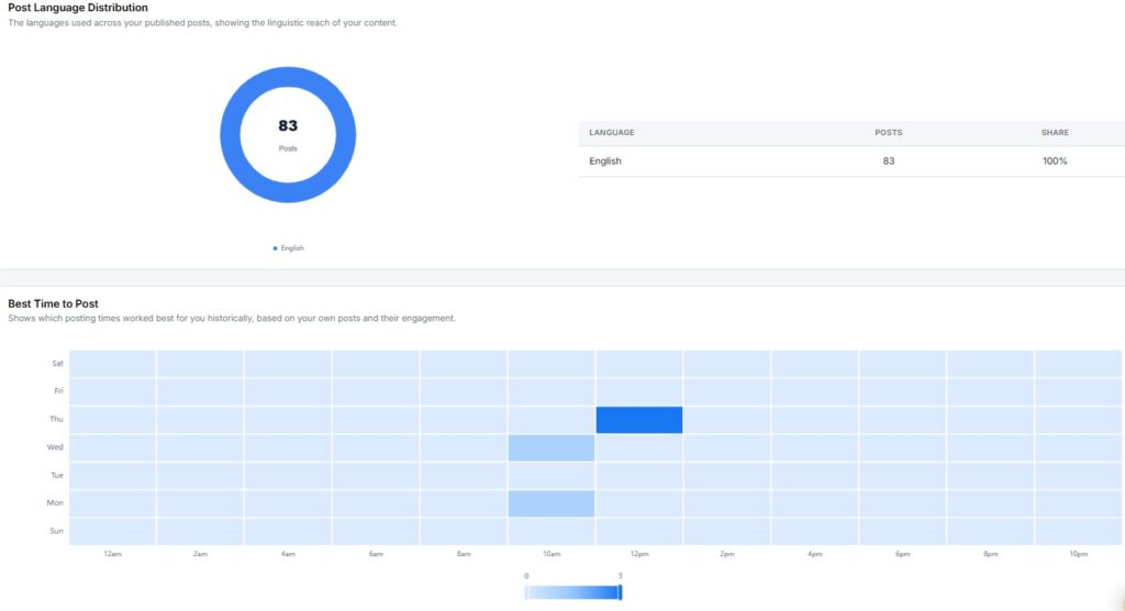
Post Language Distribution
The Post Language Distribution report shows which languages you used across your published posts. This gives you a view into the linguistic reach of your content.
Best Time to Post
The Best Time to Post report shows a heatmap of the posting windows that worked best for your account historically, based on your own posts and their engagement. The grid plots days of the week on the Y-axis and hours of the day on the X-axis.
Darker cells indicate higher engagement during that time slot. Schedule your most important posts during those windows for the best shot at reaching more of your audience.
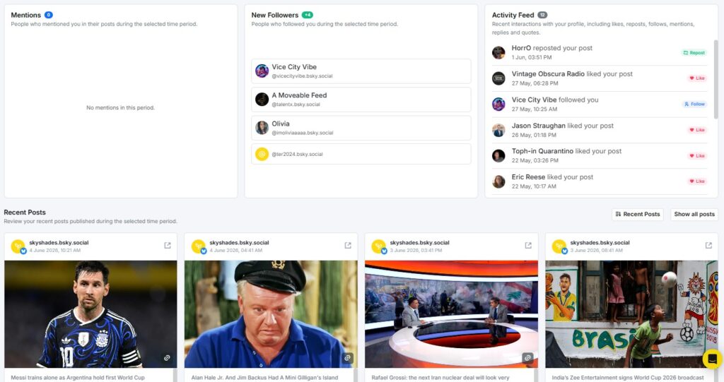
Latest Mentions
The Latest Mentions section shows recent posts from other Bluesky users that mentioned your account. This helps you track conversations happening around your profile so you can respond and stay connected with your audience.
New Followers
The New Followers section shows the Bluesky accounts that followed you during the reporting period. Reviewing new followers helps you understand who your content is attracting.
Activity Feed
The Activity Feed gives you a chronological view of interactions on your account during the selected period – likes, reposts, quotes, and replies in one place.
Recent Posts
The Recent Posts section lists the latest posts you published during the reporting period. Each postcard displays:
- Quotes
- Post content and thumbnail
- Total Engagements
- Likes
- Replies
- Reposts
10. How to see Google Business Profile Analytics?
RecurPost supports Google Business Profile analytics. You can track how customers find and interact with your business listing – all from one place.
When you open the GBP report, you see two things right away: your Average Rating and Total Reviews. These give you a quick pulse check on how customers feel about your business.
Below that, the Performance Snapshot shows key metrics compared to the previous period.
Account Overview
The Account Overview section shows live stats for your Google Business Profile listing.
- Average Rating: Your current star rating across all reviews.
- Total Reviews: The total number of customer reviews on your profile.
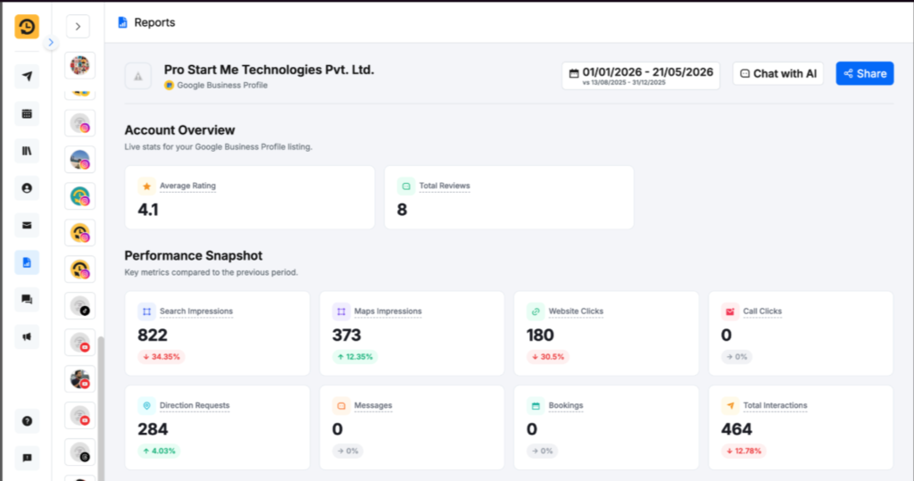
Performance Snapshot
This section shows eight key metrics side by side. Each metric also shows a percentage change vs. the previous period.
- Search Impressions: How many times your listing appeared in Google Search.
- Maps Impressions: How many times your listing showed up on Google Maps.
- Website Clicks: How many people clicked through to your website.
- Call Clicks: How many people tapped the call button on your listing.
- Direction Requests: How many people asked for directions to your location.
- Messages: How many messages have customers sent through your listing.
- Bookings: How many bookings came through your profile.
- Total Interactions: The combined count of all the above actions.
These numbers tell you exactly how much traffic your listing drives and what kind.
Customer Actions
The Customer Actions section gives a daily breakdown of how customers interact with your listing. It tracks clicks, calls, directions, messages, and bookings over time.
This chart helps you spot patterns. If direction requests spike on weekends, that tells you something about when foot traffic peaks.
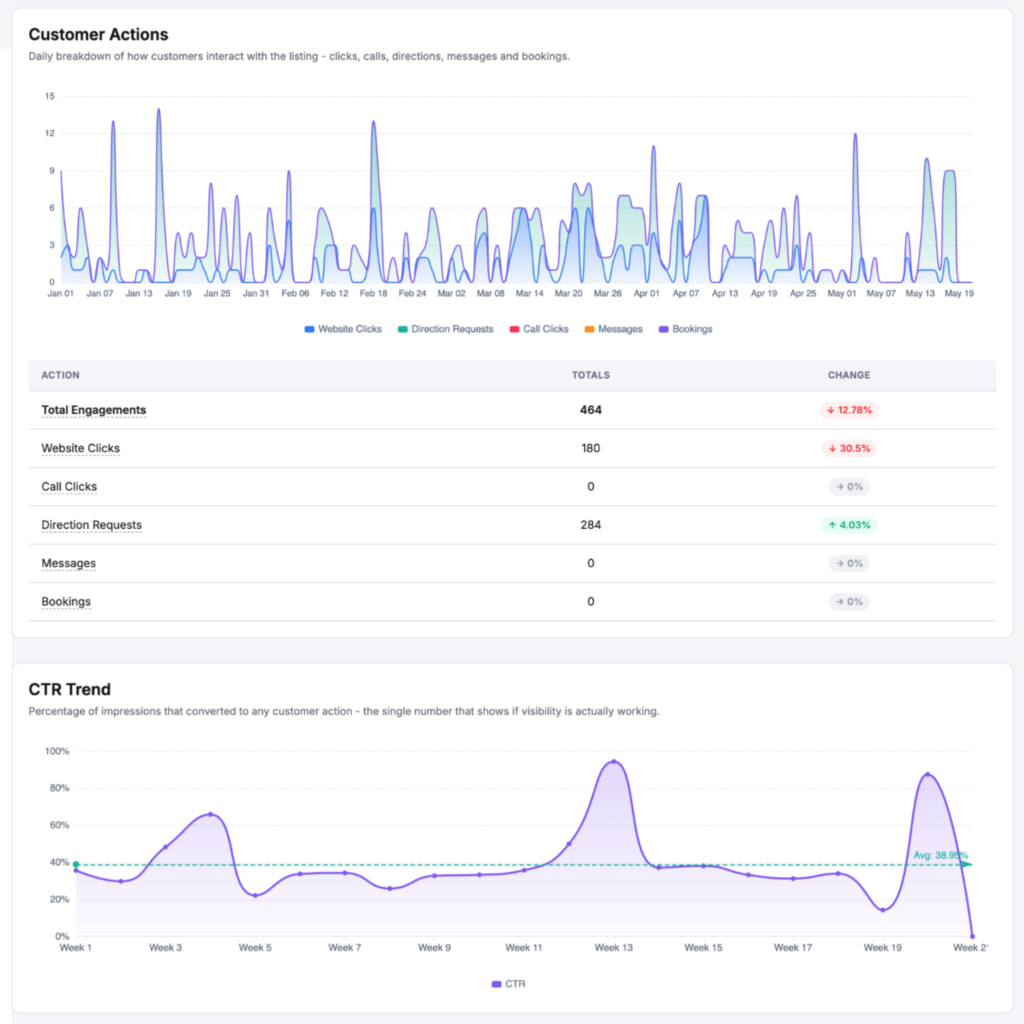
CTR Trend
The CTR Trend report tracks your click-through rate over time. It shows what percentage of people who saw your listing actually clicked on it.
A rising CTR means your listing is getting more attention. A flat or falling rate may mean your title, photos, or description need a refresh.
Reviews Summary and Recent Reviews
The Reviews Summary shows your overall review performance at a glance. You can see total review count, average rating, and a breakdown by star level.
Below the summary, Recent Reviews lists the latest customer feedback. You can read what customers are saying without leaving RecurPost.
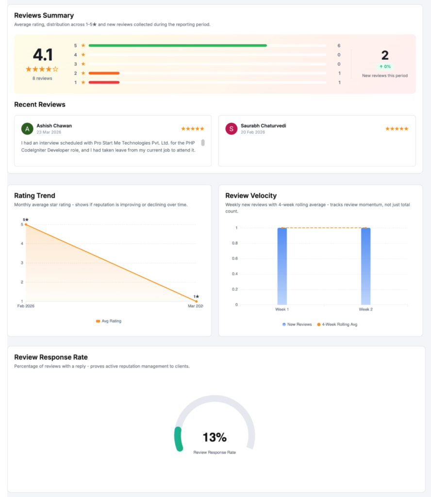
Rating Trend
The Rating Trend chart shows how your average star rating has moved over your selected date range. You can see if your rating is going up, holding steady, or slipping.
This is useful for spotting the impact of a surge in reviews — good or bad.
Review Velocity
Review Velocity tracks how fast new reviews are coming in. It shows the number of reviews added per day or week, depending on your date range.
A sudden spike in velocity could signal a campaign or a viral moment. A sharp drop might mean engagement with your listing has slowed down.
Review Response Rate
The Review Response Rate shows what percentage of reviews you have responded to. Responding to reviews, especially negative ones, builds trust with potential customers.
This metric holds you accountable. Aim to keep your response rate as high as possible.
Impressions Breakdown
The Impressions Breakdown shows how your total impressions are split across different Google surfaces. You can see where people are finding you — Search, Maps, or both.
This helps you understand which Google touchpoint is driving the most visibility for your business.
Impressions Split
The Impressions Split gives a visual breakdown of your Search vs. Maps impressions. It shows the share of total impressions each source contributes.
If Maps impressions are rising, your local SEO is gaining traction. If Search impressions dominate, customers are finding you through keyword searches.
Actions Distribution
The Actions Distribution chart breaks down how customers act after seeing your listing. It shows the share of each action type — calls, directions, website clicks, messages, and bookings.
This tells you what your audience actually wants. A business with lots of direction requests may need to focus on local walk-in customers.
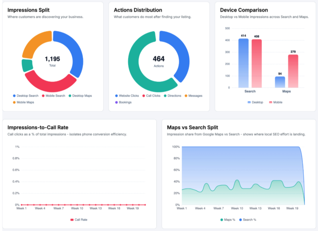
Device Comparison
The Device Comparison report shows how your listing performs across desktop and mobile. It breaks down impressions and actions by device type.
Most local searches happen on mobile. This report confirms whether that holds true for your audience.
Impressions-to-Call Rate
The Impressions-to-Call Rate measures how many impressions it takes before someone calls your business. It is one of the clearest signals of listing quality.
A low rate means people see your listing but don’t act. A high rate means your listing converts well.
Maps vs Search Split
The Maps vs Search Split shows a side-by-side comparison of traffic from Google Maps vs. Google Search. Both numbers are tracked over your selected date range.
Use this to see which channel drives more traffic and where you should focus your local SEO work.
Action Mix Shift
The Action Mix Shift report shows how your action types have changed compared to the previous period. It highlights which actions increased and which decreased.
For example, if website clicks dropped while calls went up, that shift tells you something about how customers prefer to contact you.
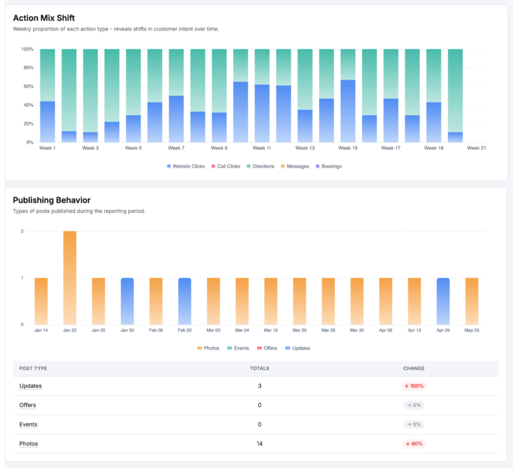
Publishing Behavior
The Publishing Behavior section shows how often you post updates to your Google Business Profile. It tracks post frequency and type over your selected date range.
Regular posts keep your listing active and signal to Google that your business is current. Use this report to stay on top of your posting rhythm.
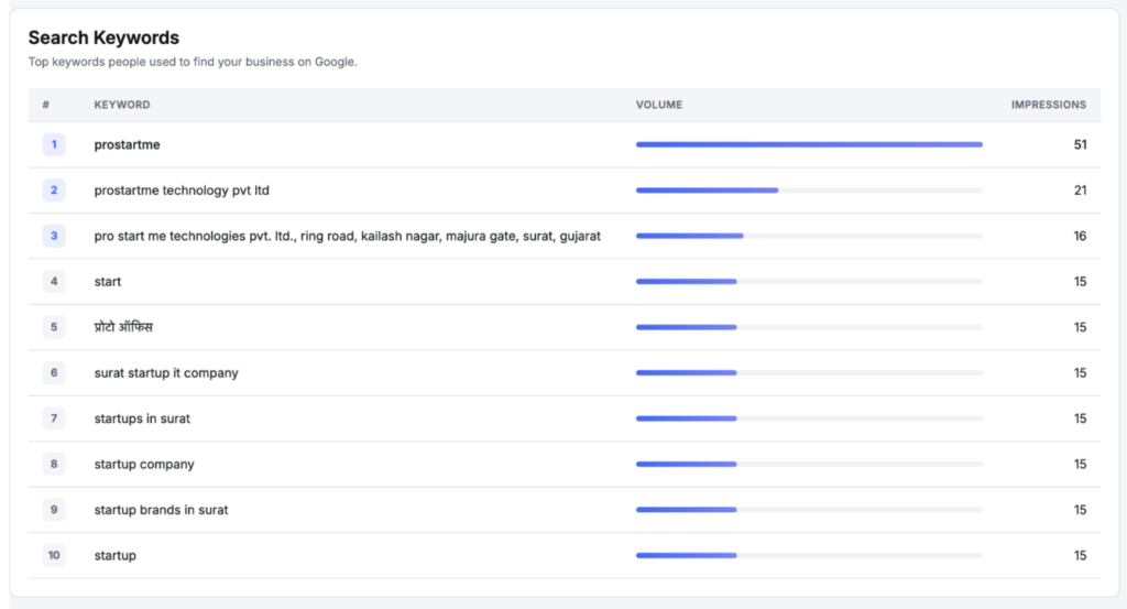
Search Keywords
The Search Keywords report shows the actual terms people typed into Google before finding your listing. This is direct data on how customers describe your business.
Use these keywords to write better listing descriptions, posts, and responses.
Q&A Engagement
The Q&A Engagement section tracks the questions customers have asked on your Google Business Profile. It shows how many questions were asked and how many have been answered.
Unanswered questions can cost you customers. Keep this section clean by responding promptly.
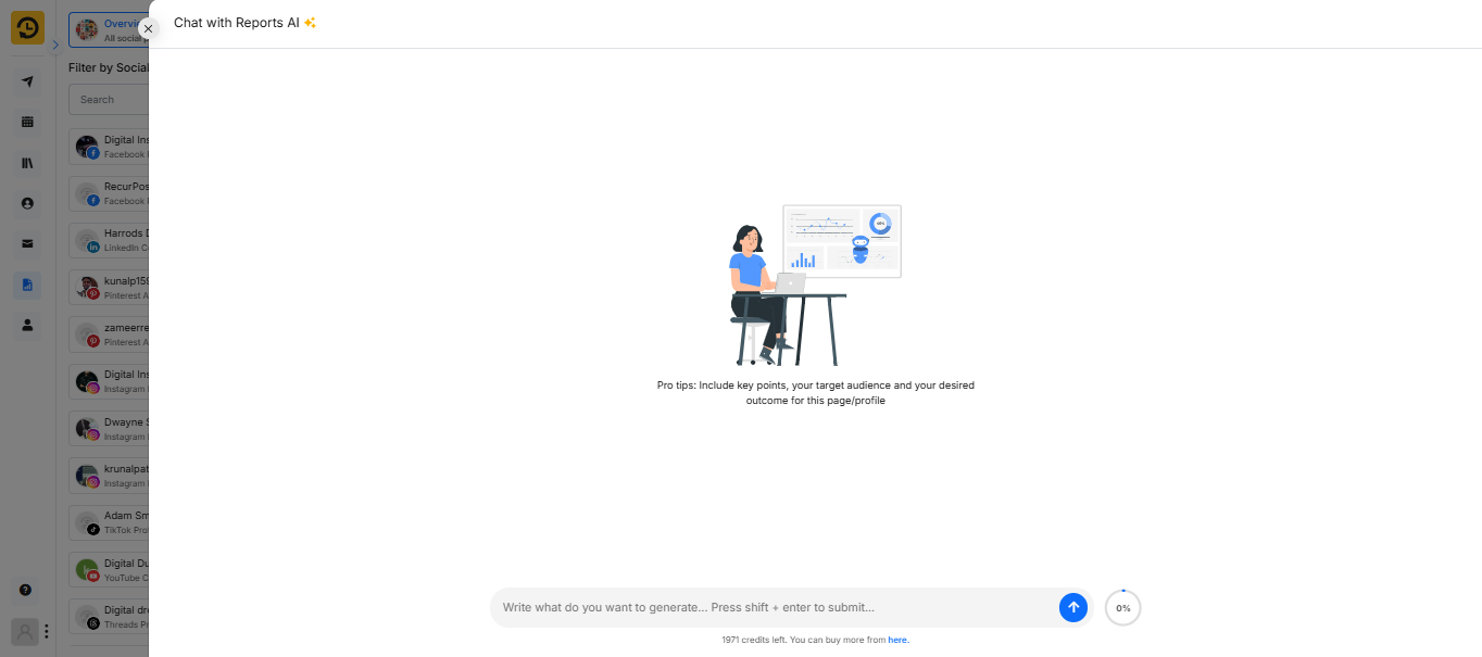
What is Chat with Reports AI?
RecurPost’s “Chat with Reports AI” is an innovative feature that transforms how you interact with your social media analytics. Instead of manually sifting through extensive data, this tool allows you to obtain real-time insights simply by asking. Here’s how it works:
- Instant Insights: Pose a question, and receive immediate, data-driven answers about your social media performance.
- Performance Breakdowns: Understand which content is resonating with your audience through detailed analyses.
- Smart Recommendations: Receive tailored suggestions to enhance your social media strategy based on current performance metrics.
This interactive AI simplifies complex reports into straightforward, actionable insights, enabling you to focus more on growth and engagement rather than data analysis.
Watch video here-
Note:
- Under the ‘Overview’ Reports, you see the analytics of all the social accounts and that includes the posts you have shared from RecurPost.
- The ‘Overview’ Reports can only store the data of ‘Likes’ and ‘Count’ for the 7 days (from the date of the post shared). After this period, the ‘Likes’ and ‘Count’ data are not retrieved. However, other statistics will be displayed fine.
- If you click on the specific Social Account on the Reports page, then it will display analytics of the posts that were shared from RecurPost, as well as those without RecurPost.
- We try to get the data of social accounts instantly and show them under ‘Overview’ Reports as well as a specific ‘Social Account’ Report. However, sometimes social media platforms do not provide the data instantly; in that case, you may see some delay.
- With YouTube’s latest policy update, only data from the past 15 days is accessible in YouTube Reports. Furthermore, downloading reports and viewing post history details – such as likes, comments, and views are now restricted. These changes have been reflected in RecurPost’s YouTube reporting features.